- Home |
- Search Results |
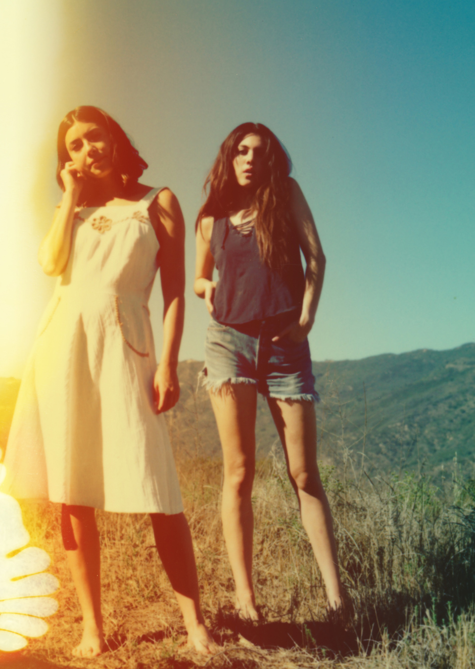
- Designing The Girls

Suzanne, The Girls is set in California during the summer of 1969, an era that has been much photographed and replicated in fashion imagery since, how did you go about finding the right image for the cover?
SD: Finding an image that was suitable for the cover proved more difficult than I had imagined. Nothing came close to achieving the look I was after. I remembered that a few years ago I had come across a photograph by Neil Krug.
Lily Richards, our Picture Researcher, pulled up his website and straight away it felt that Neil’s work had been waiting for this book. When we discussed the project further with Neil, we discovered how heavily his aesthetic is influenced by the Manson case. His photos look like they have come out of a 1970s family album. Striking in colour, they are purposefully grainy with a blurry aesthetic. Many are shot with polaroid film (kept years past its sell-by date) to create this evocative feel.
Neil’s work offered us the opportunity to commission some images that we could use on the cover that had the right content and looked wholly engaging and authentic.

Neil, you’ve worked with big brands, magazines and record labels; what was it that attracted you to working on a book cover?
NK: The first thing that piqued my interest was the description of the girls. It felt like something that is pretty much a recurring theme in my own work, and I knew I wanted to explore working on a book cover because I don’t often get asked to do stuff like that.
That era and the imagery from the Manson case are so recognisable visually, is it a style that you’ve always been drawn to?
NK: The Manson imagery – I don’t know how many times it’s come up in mood boards throughout various projects that I’ve worked on in my career. It’s not that we’re trying to copy an idea of anything particular from that era, it’s just the overall mood of that imagery, that whole kind of iconography has been fascinating to me.
Finally, Suzanne, the heart that adorns the inside of the book’s boards – where did that come from?
SD: The Girls heart logo was created in response to a heart drawn in blood in the novel. It was a challenge because the iconography of a heart traditionally gives a very different message to the one I wanted to portray, especially as the heart would be seen next to the words ‘The Girls’. I painted countless hearts roughly and quickly, in black and red, until I had the right balance of edge and darkness.