- Home |
- Search Results |
- Punk and a new DIY culture: Sarah Hyndman on the evolution of punk typography
Punk and a new DIY culture: Sarah Hyndman on the evolution of punk typography
In Why Fonts Matter, Sarah Hyndman looks at how the shapes of words affect the way that we perceive value and personality. In this article the author looks at the typography of the punk movement and wonders what the font of our youth rebellion will be
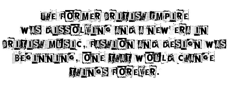
Taking the stage to articulate the feelings of a dissatisfied generation calling for change were the Sex Pistols, who released their infamous debut single ‘Anarchy in the UK’ in 1976. Their outrageous behaviour and contempt for established conventions announced the beginning of Punk. The band’s style of music was well represented by art student and anarchist Jamie Reid who had developed his unique collaged ‘ransom note’ typography whilst art directing a radical political magazine.

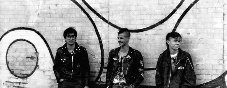
Although at the time Punk looked like a spontaneous youth movement, it was part of the Postmodernist movement that began as a reaction to the rigid restrictions of Modernism.
Apple had not yet released the first Macintosh computer, and home computers were still in the realm of science fiction. To create a record cover or a poster, a graphic designer would commission a typesetter who would type the words into a machine with no screen; they were unable to see what the typeset words would look like. The words were then printed on a photographic sheet to be pasted down onto the artwork, which was then photographed to create the printing plate. This was a laborious and expensive process.
Reid circumnavigated this process, and instead he cut letters out of newspapers and magazines, collaging them together to be photographed. By doing this he could see what he was creating as he went along—trying out different font styles and sizes and seeing the results instantly. Treating type as if it was a photograph freed him from the restrictions of typesetting within a structured grid. There are parallels to be seen in the typography of the Futurist and Dadaists who used innovative ways to brace letters at angles in letterpress frames.
Although at the time Punk looked like a spontaneous youth movement, it was part of the Postmodernist movement that began as a reaction to the rigid restrictions of Modernism. Elsewhere Postmodernism was taking the form of New Wave Design, which was championed in Switzerland by Wolfgang Weingart and in Holland by Gert Dumbar.
The DIY design ethos gained new impetus with the arrival of the Apple mac in the 1980s. This gave designers direct access to typefaces and, for the first time, they could see what they were creating ‘live’ on screen as they designed it.
Punk is 40 years old this year. The DIY ethos is stronger than ever with the advent of new software and platforms such as Instagram where everybody can share their designs. What do you think the typography of a youth rebellion would look like today?