- Home |
- Search Results |
- Creating the Murakami Diary 2020
Setting the scene
The Murakami Diary invites you into the world of Murakami. Whilst being stylish and colourful, and a pleasure to use, it was essential that it remained functional. We also wanted to showcase all of Murakami’s books, and the titles and their respective publication dates, along with seasonal quotes, which all helped to determine the placement of the imagery throughout the diary.
We were influenced by Japanese aesthetics and sourced original material as well as creating our own illustrations. Many of the current Murakami book covers published by VINTAGE are included, but we also feature previously unseen cover options that didn’t make the final cut.
Here are some of our favourite pages.
The front cover
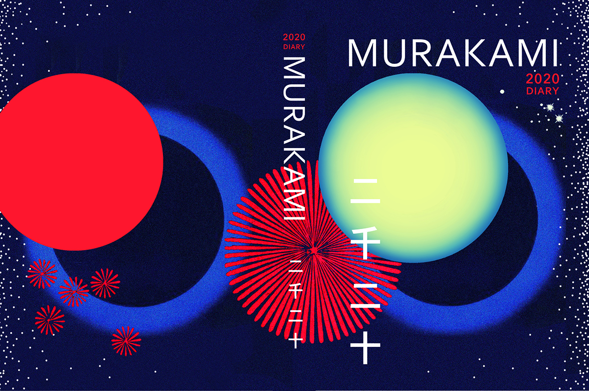
The diary cover incorporates a circular motif, which is typical of all our Murakami covers. The design features a starry sky which hints at a year of possibilities, and Japanese firework designs from the early 1900s sourced from the Yokohama Public Library. These fireworks also appear on pages at the start and end of the year to symbolise celebration. The Japanese lettering says ‘2020’.
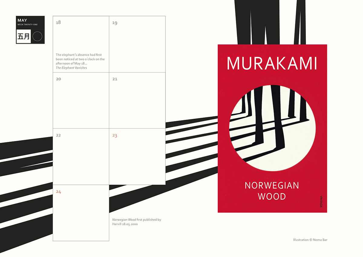
Noma Bar and Norwegian Wood
Murakami’s work has a sense of something being lost or hidden, leading the reader to question what is real and what isn’t. Noma Bar’s powerful graphic illustrations cleverly utilise negative space to conceal secondary images and illusions and his illustrative approach felt a perfect match for Murakami’s book covers. A particular favourite of ours appears on 18 May, the date Norwegian Wood was first published. Here the background illustration playfully extends the linear imagery of the cover design to dramatic effect over the double-page spread.
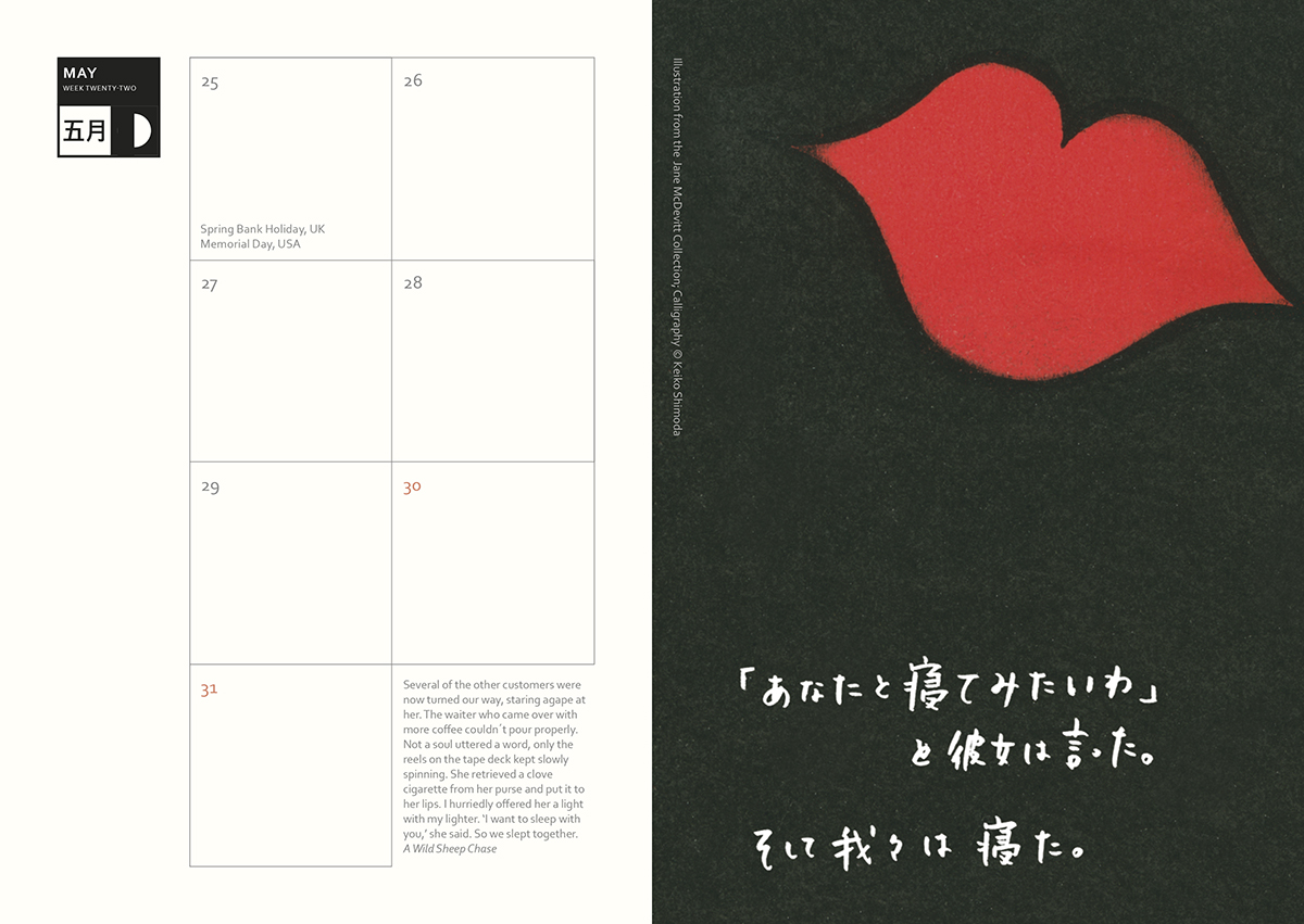
Matchbox labels and A Wild Sheep Chase
The archive of designer and collector Jane McDevitt proved to be a great source of authentic Japanese matchbox labels and we have used several throughout the diary. They are charming, nostalgic and immediate; with their bold illustrations they are like mini posters.
For the week of 25 May we chose a large pair of red lips against a black background. The quote from A Wild Sheep Chase helped inform the design: ‘She retrieved a clove cigarette from her purse and put it to her lips. I hurriedly offered her a light with my lighter. “I want to sleep with you,” she said. So we slept together.’
Murakami 2020 Diary
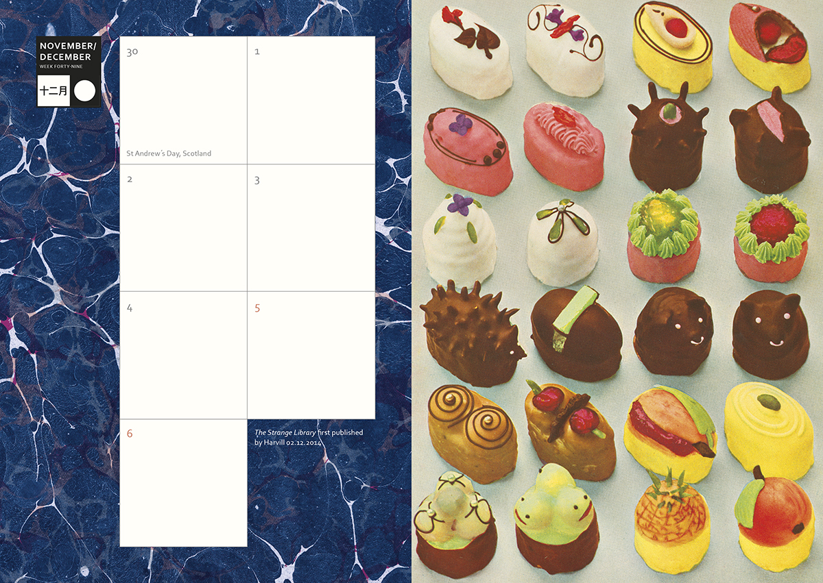
Cakes in The Strange Library
Several pages feature images first created for the illustrated edition of Murakami’s The Strange Library. Publication date, 2 December, marks a particular favourite of ours, with a photograph of a hyperreal assortment of cakes. This illustration was sourced from an out-of-copyright German cookbook, found in The London Library.
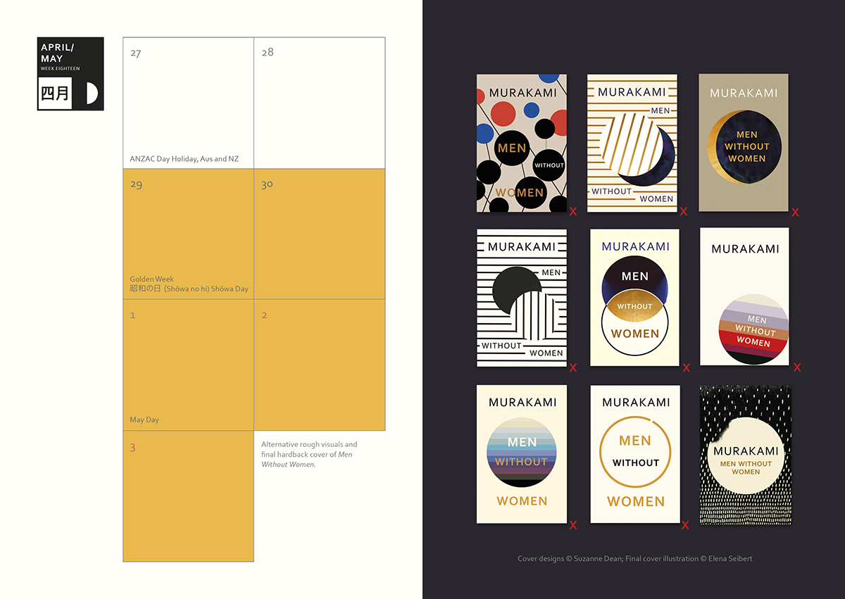
Men Without Women from the cutting room floor
The diary also features lots of rough sketches and alternative book cover designs. 27 April shows a page of alternative cover visuals that didn’t make the final cut, alongside the approved hardback design (bottom right) of Men Without Women. The series of visuals explores the idea of isolation and loneliness.
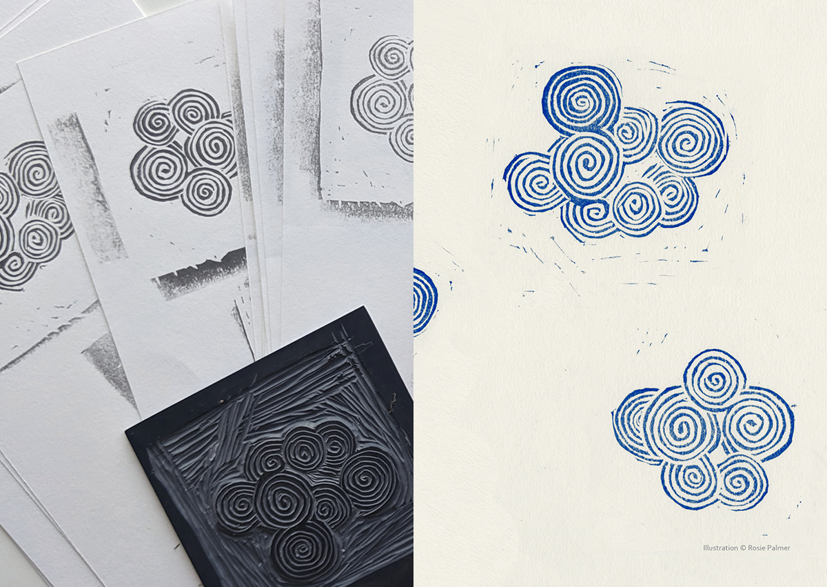
Linocut clouds inspired by ‘A Poor Aunt Story’
The quote for the week of 13 July – ‘It started on a perfectly beautiful Sunday afternoon in July – the very first Sunday afternoon in July. Two or three chunks of cloud floated white and tiny in a distant corner of the sky’ – is taken from ‘A Poor Aunt Story’ in the collection Blind Willow, Sleeping Woman. It prompted a linocut of clouds, the style of which was inspired by an old Japanese print.
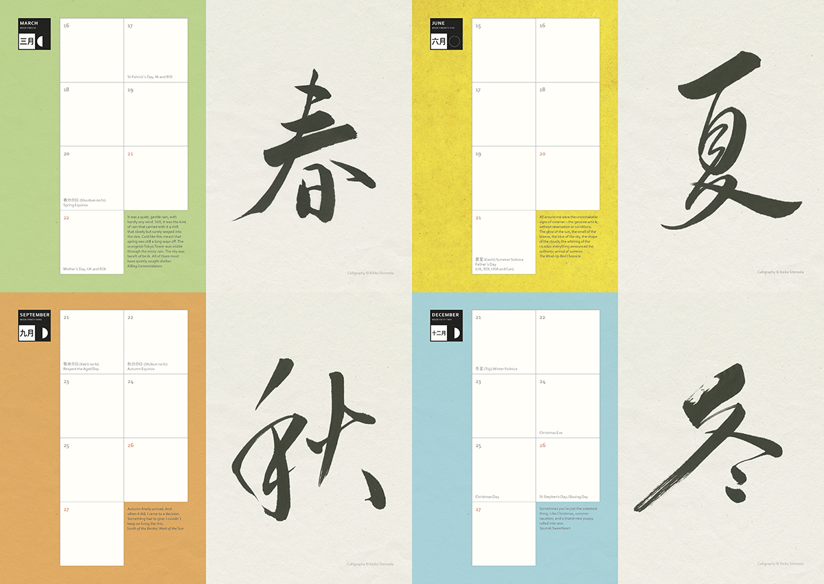
Japanese calligraphy for the four seasons
We were keen to highlight the seasons within the diary and commissioned Keiko Shimoda to write spring, summer, autumn and winter in Japanese calligraphy.
Japanese-born Keiko started to learn her craft of Japanese calligraphy at just four years old. A freelance calligrapher since 2010, she now specialises in both the Western and Japanese alphabets. She has worked on many film sets and for top fashion brands like Burberry, Jimmy Choo, Mulberry and Estella Bartlett. (Clockwise from top left: spring, summer, autumn, winter.)
Sign up to hear the latest news from Murakami
By signing up, I confirm that I'm over 16. To find out what personal data we collect and how we use it, please visit our Privacy Policy