- Home |
- Search Results |
- The story of UK lockdown, as it unfolded on Google Trends
For most of us, when we want to know something, we search online. In fact, it is such natural impulse that minute changes in UK-wide online searches can offer insight into the national psyche. And according to Google Trends – the eponymous company’s free service by which anyone can check what everyone else has been searching for – that’s precisely what it’s done for the last while.
Out of curiosity, I loaded up Google Trends to take a look at how online searches have changed between 1 February 2020 and the end of May. Including February means we have a good lead-in baseline to see what the pre-coronavirus ‘normal’ looked like. For example: here is the plot for how much people were searching for “face mask” during those dates:
“Face mask”:
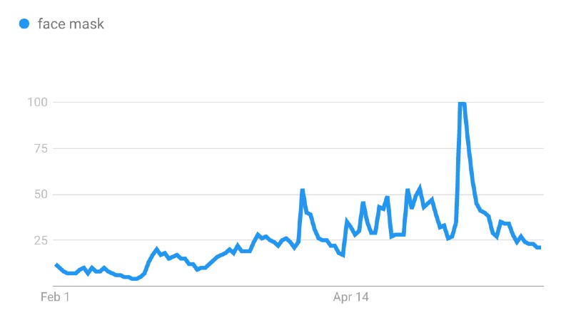
There is a definite spike on 2 April, and this is where looking at a plot becomes the nerdy equivalent of reading tea leaves. Was that because 2 April is when Health Secretary Matt Hancock announced the “five pillar” plan for virus-testing, or was it because the number of deaths had just jumped into the thousands and people were finally taking it seriously? We often cannot say. But the massive spike on 11 May was on the same day that Boris Johnson released the recovery strategy to wind up the lockdown, so it seems the tantalising prospect of being allowed out of their homes was the first time the UK started earnestly searching for face masks.
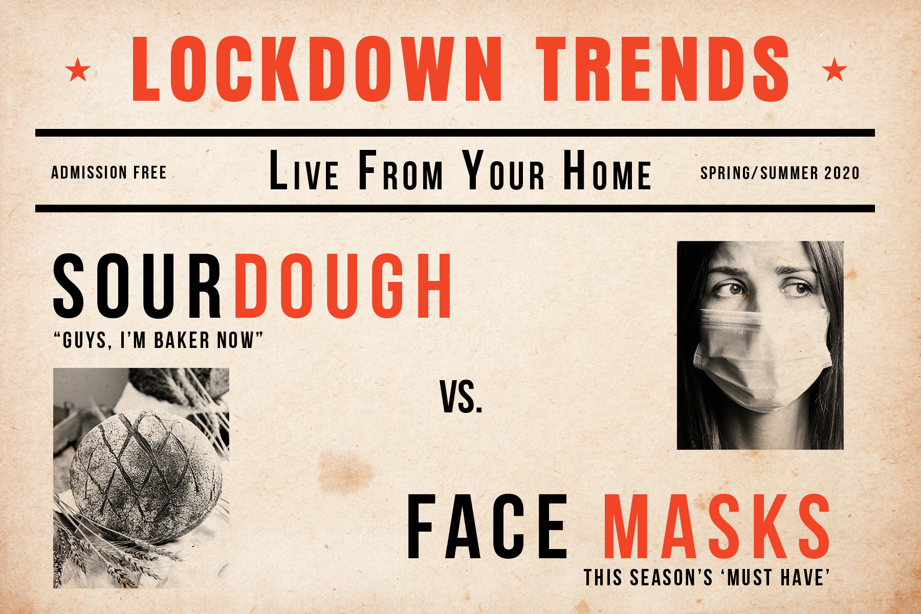
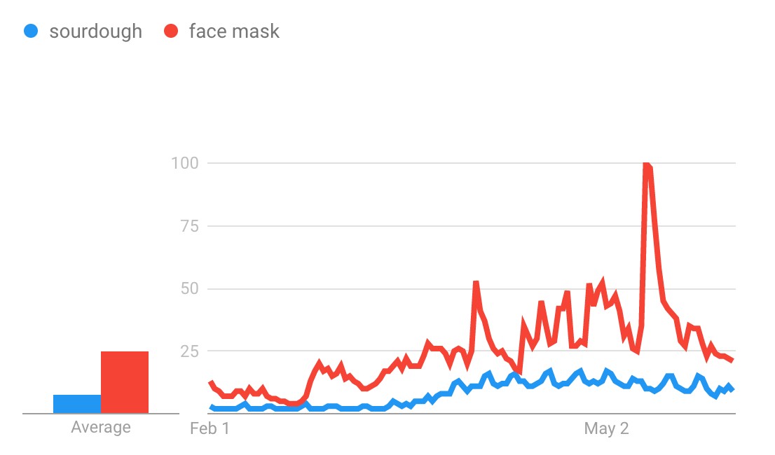
Something to note: Google Trends will always scale the graphs so that the biggest spike is right at the top, which means it can be deceptive to just eyeball two different plots and compare them. When I searched “sour dough”, for example, a single massive peak made it look like the people of the UK cared more about their hipster toast than they did searching for face masks to stop the spread of the virus. But if you plot them both together, you can see “sour dough” correctly scaled (though they came close to each other on 12 April):
“Sour dough” vs. “face mask”:
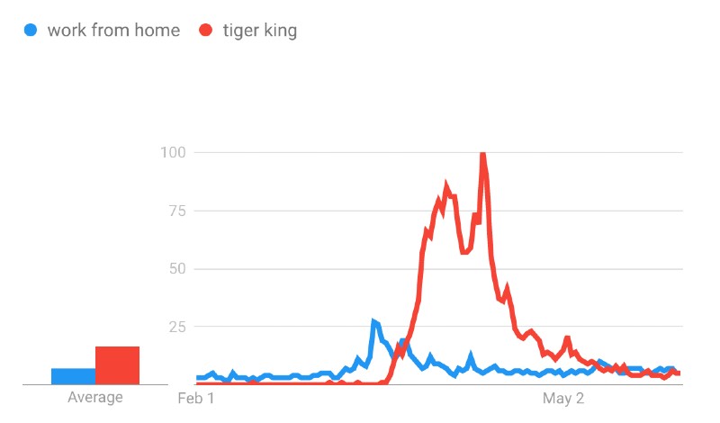
As you can expect, there was an increase of people searching for “work from home” when the lockdown restrictions started. Those two highest peaks are the 16 and 23 March – both Mondays, as you can see below:
“Work from home”:
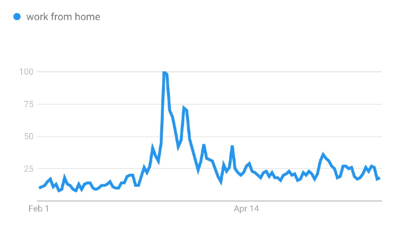
It seems most of us were fine over the weekend, but come Monday decided to look into this whole notion of working from home. By late March the number of searches had dropped back down closer to their original level. Maybe everyone was starting to get the hang of the home office?
Conveniently, Google Trends will let you compare two different search terms on the same graph. And if you compare searches for “Tiger King” to “work from home,” it seems that maybe the people of the UK simply changed their priorities in terms of how productive they felt like being.
“Work from home” vs. “Tiger King”:
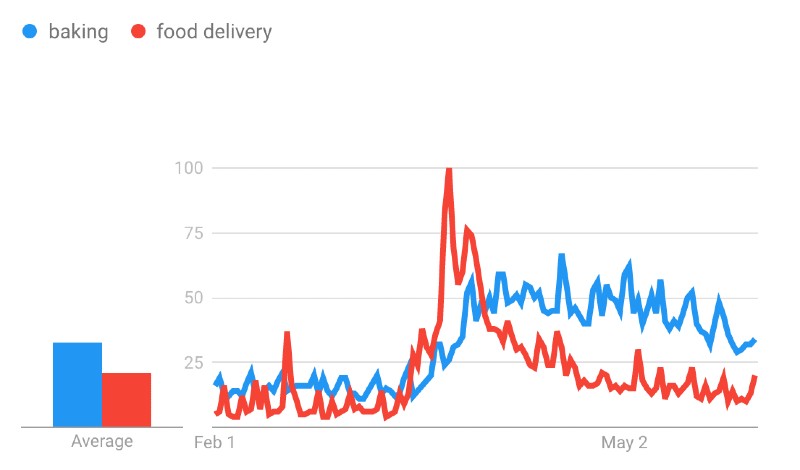
Baking became a bit of a theme over the course of lockdown, though it was supplanted for a big week or so in March. If you plot searches for “baking” against “food delivery”, you can see the huge spike in searches for home delivery starting on 23 March and peaking the next day. On 23 March it was announced that the lockdown was now being enforced, and people rushed to order their groceries online, only to find delivery slots were about as available as the toilet paper people were futilely adding to their online baskets. The 1 April is when the graphs cross over, and represents when we all decided to take matters into our own hands and bake bread which would fail to raise to our expectations (a bit of a theme during the coronavirus response in general, I’d say).
“Baking” vs. “food delivery”:
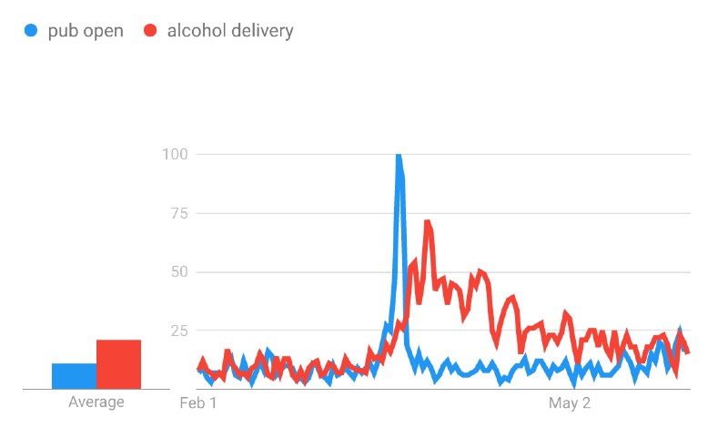
The UK’s hopes were dashed again when it came to booze. The graph below shows us we hit peak British optimism that the pub may still be open on the 21 March, five days after we’d been asked nicely not to go out drinking, and two days before the enforced lockdown. Searches for alcohol delivery then took over as everyone scrabbled to adjust. Alcohol delivery searches soon settled down a bit, with peaks on April 4, 11, 18, 25... all Saturdays. Seems we are still struggling to learn to plan ahead.
“Pub open” vs. “alcohol delivery”:
But we need to be careful when analysing data: it’s fun, but there are a lot of pitfalls. There are the classic warnings that correlation does not mean causality, which reminds us that just because two things align does not mean one causes the other.
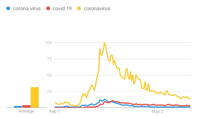
Search terms are not straightforward, either. For a short while I found the plot of “corona virus” vs “Covid 19” really interesting. ‘Corona virus’ is the name of the microscopic pathogen, whereas ‘Covid 19’ is the disease it causes. I've been fascinated at how people use them interchangeably and which one they pick. I thought this plot showed that 22 March 2020 was the exact date that the zeitgeist switched from one to the other:
“Corona virus” vs. “Covid 19”:
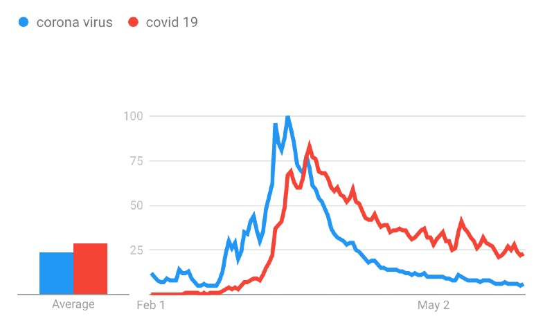
It turns out I had merely missed that people were actually searching for “coronavirus” as one word.
“Corona virus” vs. “Covid 19” vs. “coronavirus”:
So have fun with data, but be careful. And when you see someone else using data to back-up their claims: check how thoroughly/naively they have analysed it. I’ve seen data analysis from complex disease modelling computations which have been refined by experts over decades held up alongside someone who eyeballed a graph.
Data is a double-edged sword. It can get us out of this mess, but only if we use it carefully. Now if it could only give my sour dough a little bit of a trend up.