- Home |
- Search Results |
- ‘Design has the power to encourage people to start reading’: behind the book covers of Black Britain: Writing Back
‘Design has the power to encourage people to start reading’: behind the book covers of Black Britain: Writing Back
The newly launched book series, curated by Bernardine Evaristo, begins with six rediscovered novels by Black authors. Here, we speak to the artists hand-picked to create their covers.
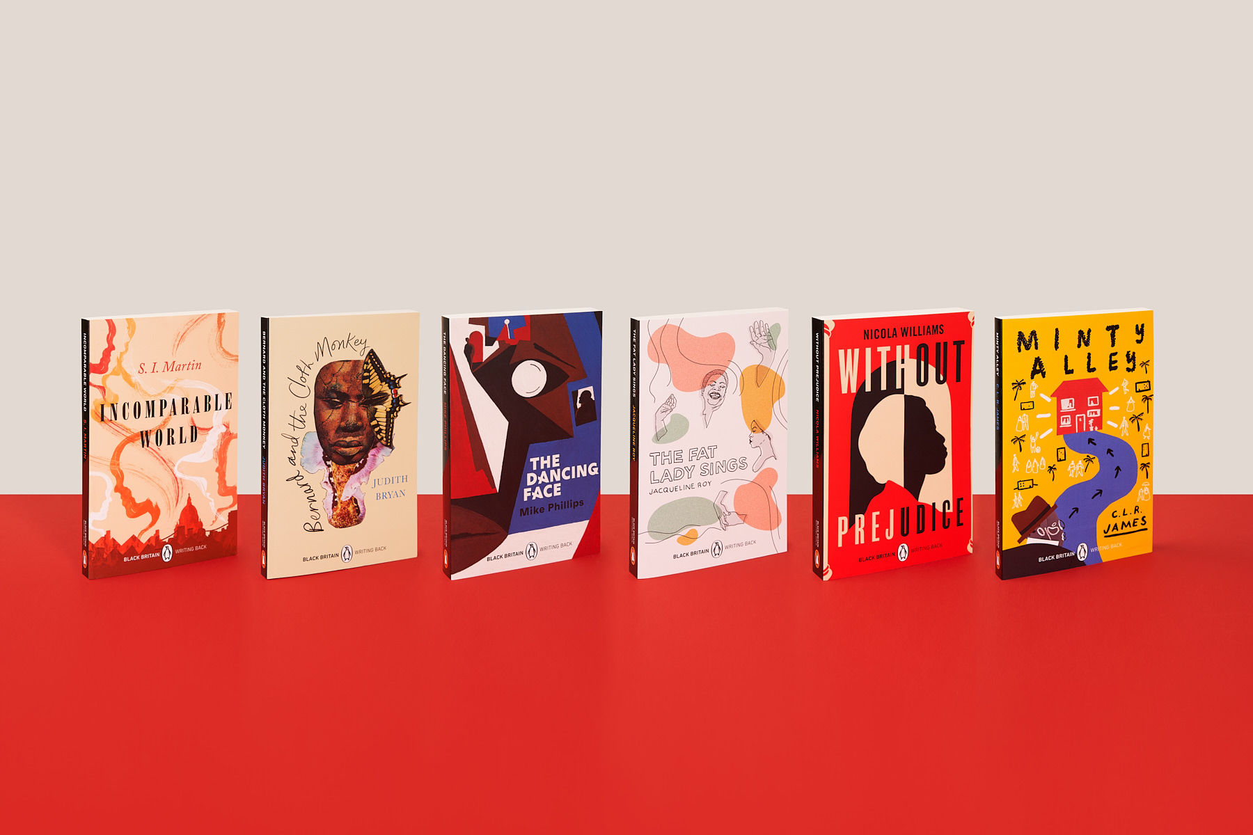
This past week marked the long-awaited first release of the ‘Black Britain: Writing Back’ series, six lost and hard-to-find novels by Black writers that, according to series curator Bernardine Evaristo, aim to “correct historic bias in British publishing and bring a wealth of lost writing back into circulation.”
The series, according to the Booker Prize winner, “will take the reader from 18th-century London to 1920s Trinidad; from inside the heads of women in the mental health system to inside the life of a working-class black women barrister making her way in a white, middle-class, male profession; from the ethics of stolen African artefacts in British museums and into a family home haunted by past that lingers in the present,” and will illustrate “a variety of preoccupations and genres that offer important and diverse Black British perspectives. I am very excited to introduce these books to new readers who will discover their riches.”
Yet even before readers crack the spine, the books’ riches are apparent: the six new titles all sport a bold, striking new cover, each designed by a carefully selected Black British artist. Here, we speak with all six of the novels’ designers – Daniel Dzonu-Clarke, Jade Douglas, Tomekah George, Alexander Ikhide, Sumuyya Khader, and Joy Yamusangie – about what makes a good book cover, the design process, and the importance of celebrating Black creativity.
Daniel Dzonu-Clarke, designer of The Dancing Face
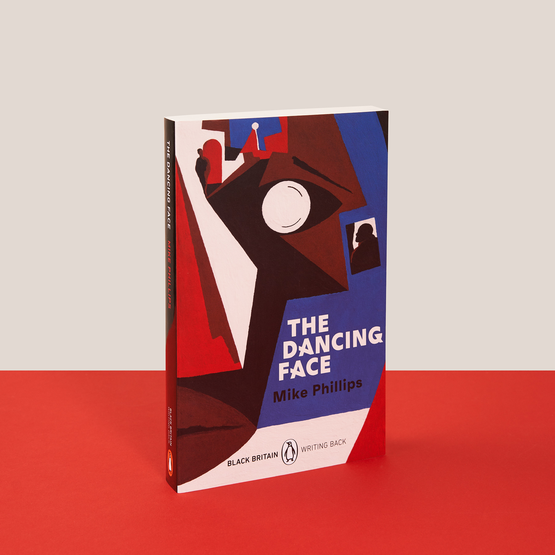
Daniel Dzonu-Clarke, a London-based illustrator and artist, used a bold, graphic style in his cover for Mike Phillips’ 1997 novel The Dancing Face, inspired by the designer of J. G. Ballard's most iconic covers, as well as the famous 1972 A Clockwork Orange cover.
“David Pelham’s book covers immediately come to mind as these tend to be fairly simple, bold graphics featuring a single object with a horizon in the background. Yet through his illustrations and colour palette, you instantly get a sense of the mood and theme, and it entices the reader to open up the book and find out what happens. So I guess for me simplicity was the key.”
Because The Dancing Face is set around London’s British Museum, “the first thing I did was go to the museum and take some photos and draw up some sketches. They have a gallery on Africa where there was plenty of inspiration for masks (the main subject of the story) so this really helped. I also sketched the local area, as the streets surrounding the building are described within the story. I got a lot of my inspiration from stepping into the book’s setting.”
His cover, a semi-abstract mask that incorporates a street scene, began as five or six different masks before he settled on a final version that combined characters and narrative “to make something abstract while giving a hint at the storyline,” in which “a mask of great talismanic importance (‘The Dancing Face’) is stolen from the British Museum.”
Jade Douglas, designer of The Fat Lady Sings
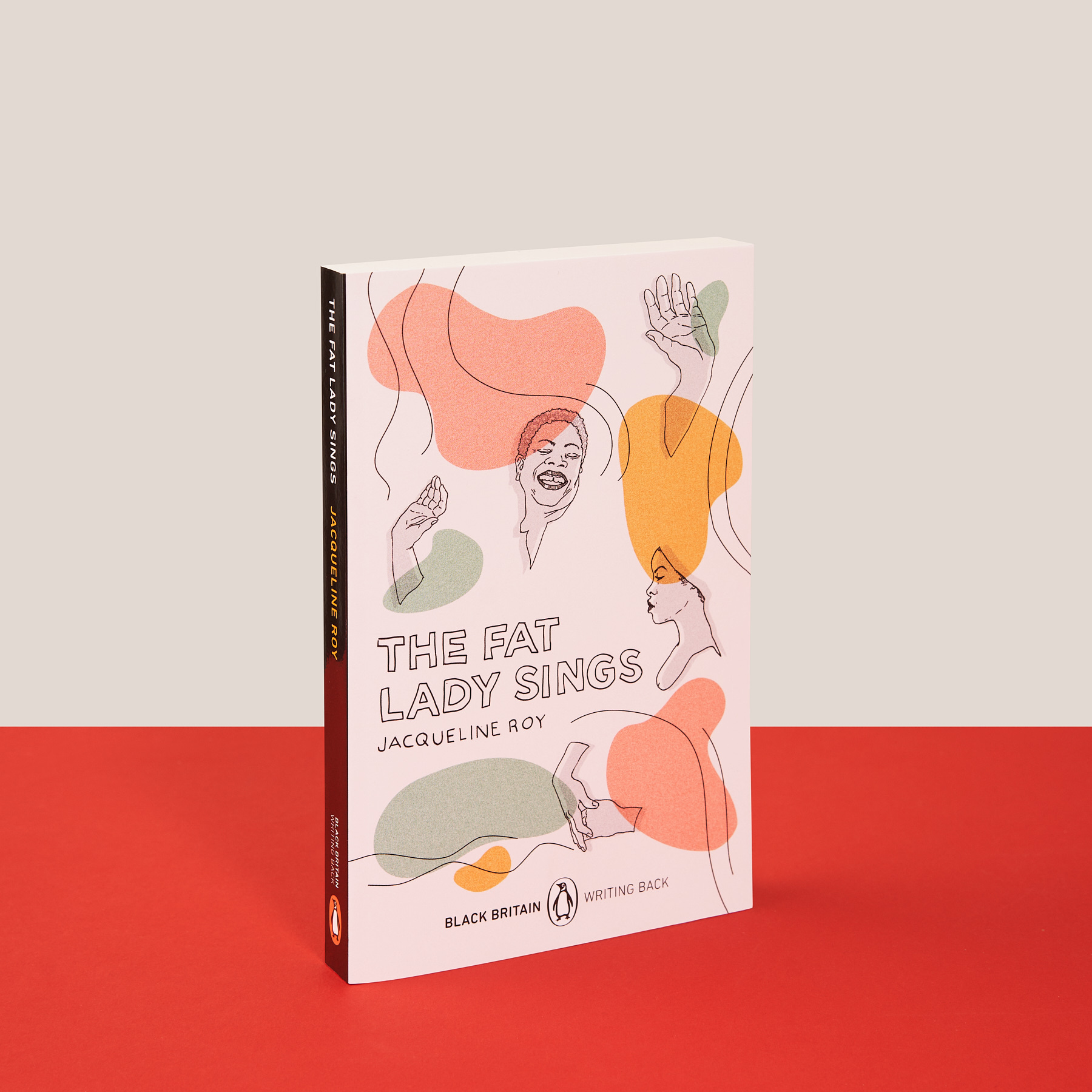
When Jade Douglas, who runs a design and visual art studio in London called Studio Fifty Five, read Jacqueline Roy’s The Fat Lady Sings, “I found that the story of one of the characters in the book was eerily similar to my Jamaican Aunt who had recently passed away. So my initial exploration involved discussions with my family and collecting pictures of her for inspiration.”
From there, Douglas “followed my usual process of sketching every idea that comes into my head, editing them down to the ones I like, then creating a selection of clean roughs for client feedback”; then, she stripped the cover back, “to keep in just the essentials.”
Roy’s novel “is the first book cover I have illustrated in my own style,” says Douglas. Having studied illustration at university, and having read Penguin books “since I was a child,” she calls her cover a “bucket list” commission, but it’s particularly close to Douglas’s heart, too.
“Being mixed Jamaican and Anglo-Indian, this commission has been exceptionally special for me because of the focus on appointing Black creatives. My father started working in the advertising industry at a time when being a Black designer was extremely difficult, so receiving a commission like this is a wonderful sign of progression and inclusivity in the design industry.”
Tomekah George, designer of Incomparable World
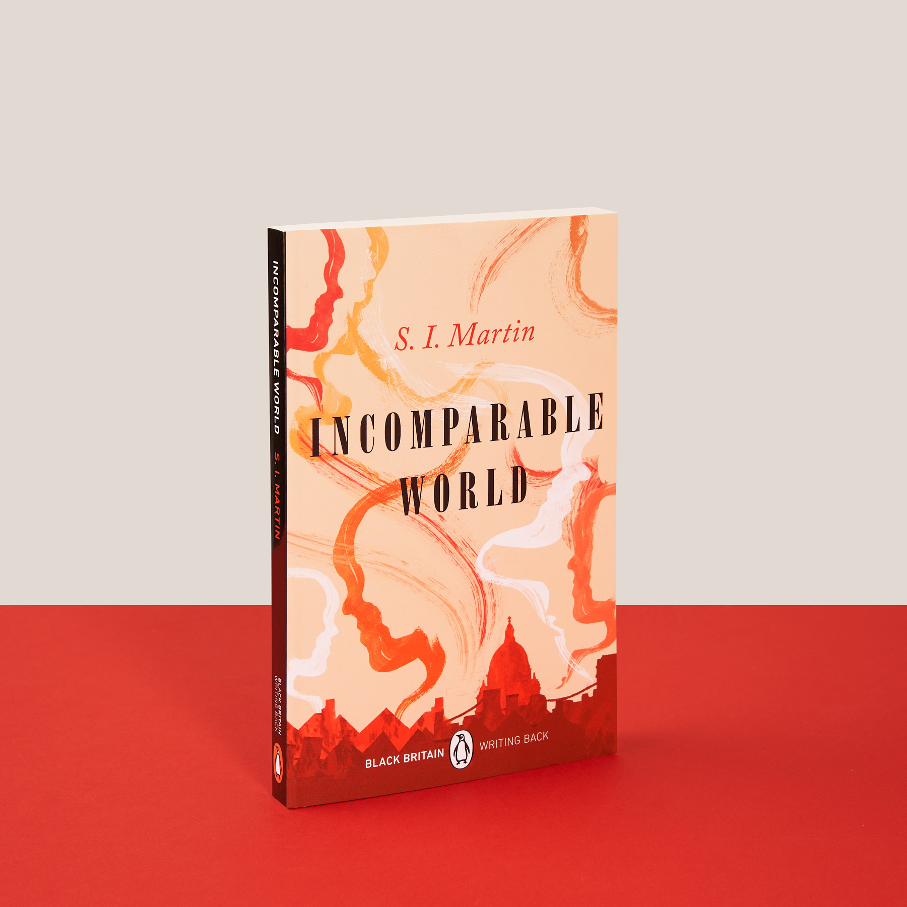
Illustrator and animator Tomekah George designed S. I. Martin’s Incomparable World, accepting the challenge of making a modern book cover “while keeping true to its historical tone.” A great book cover, she says, “gives you a flavour of what expect from the book without revealing the plot,” and her final product reflects the design process she went through as she designed it.
“It was really exciting to experiment with a lot of different ideas.” Working both with paint and in a more graphic style along the way, George eventually combined the two style for the warm cityscape that now graces the novel: “It’s almost a collage of each idea.”
Buy the books
Alexander Ikhide, designer of Bernard and the Cloth Monkey
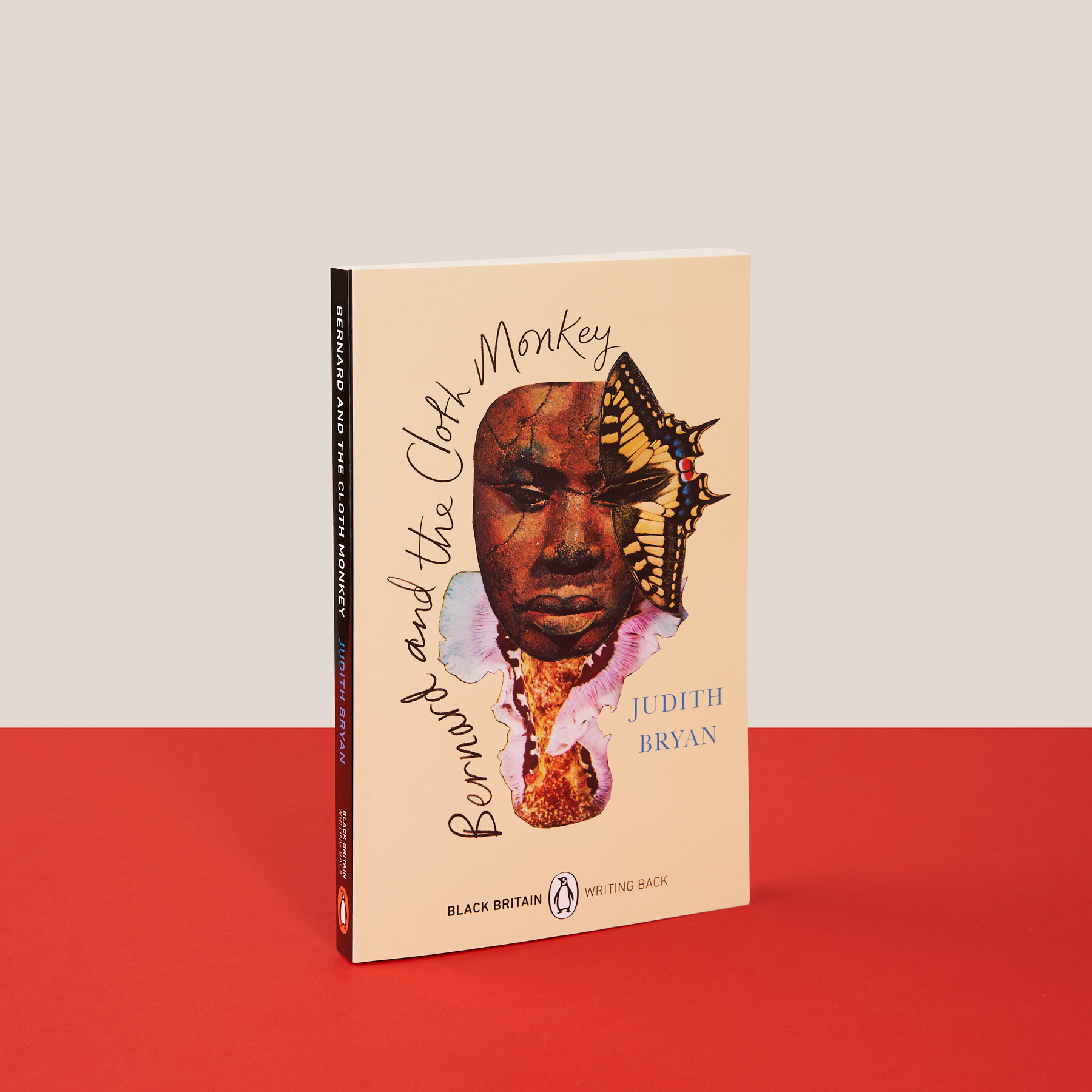
That Alexander Ikhide’s cover, for Bernard and the Cloth Monkey, should include both photography and more graphic elements is no surprise: Ikhide is both an artist and a photographer. When it came to creating a cover for Judith Bryan’s 1998 novel, he engaged both with “the plot of the book and the main theme into a single image, bringing aspects of the emotional and psychological in union. As I work with photographic images as source material for my work, there was a challenge of finding/sourcing the right images to work with to visualise my idea.”
Ikhide’s first book cover design comes at a time when, he says, “it’s more important than ever to practice care,” and he’s grateful for the timing and “opportunity to collaborate in this way, to produce an artwork that can be shared with such a diverse audience and to celebrate Black British cultural enrichment here in the UK.”
Sumuyya Khader, designer of Without Prejudice
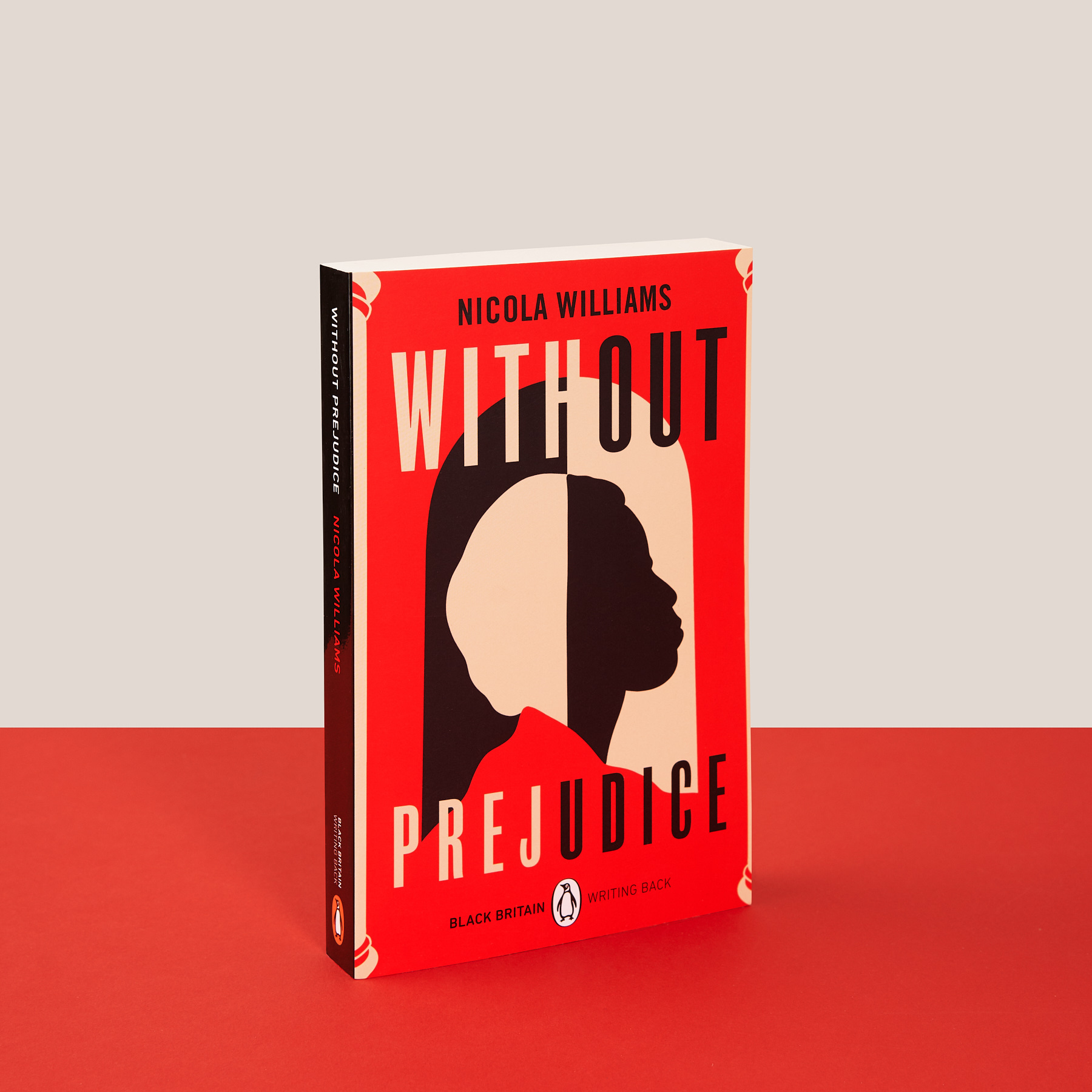
When Liverpool-based illustrator and artist Sumuyya Khader sat down to design the cover Without Prejudice, she began “by exploring place and person: who are they, in what period is it set?” Taking what she learned from the last cover she designed, for Ben Okri’s latest collection A Fire in My Head, Khader kept “the character and story at the forefront of the design and focused on a few key elements. Then I built on these with a colour palette and details.”
The hardest part of making the cover for Nicola Williams’ novel was “doing it justice,” she says. Though her initial drafts featured “a varied amount of options, from the more abstract through to clearer, stronger portraits, archways and the female figure were both initial concepts and part the final design” – both of which you can see in her striking cover art.
“It’s an absolute honour, Khader says, “to be a part of this series and have my work featured alongside an amazing group of Black designers helping to bring to life the work of Black authors.”
Joy Yamusangie, designer of Minty Alley
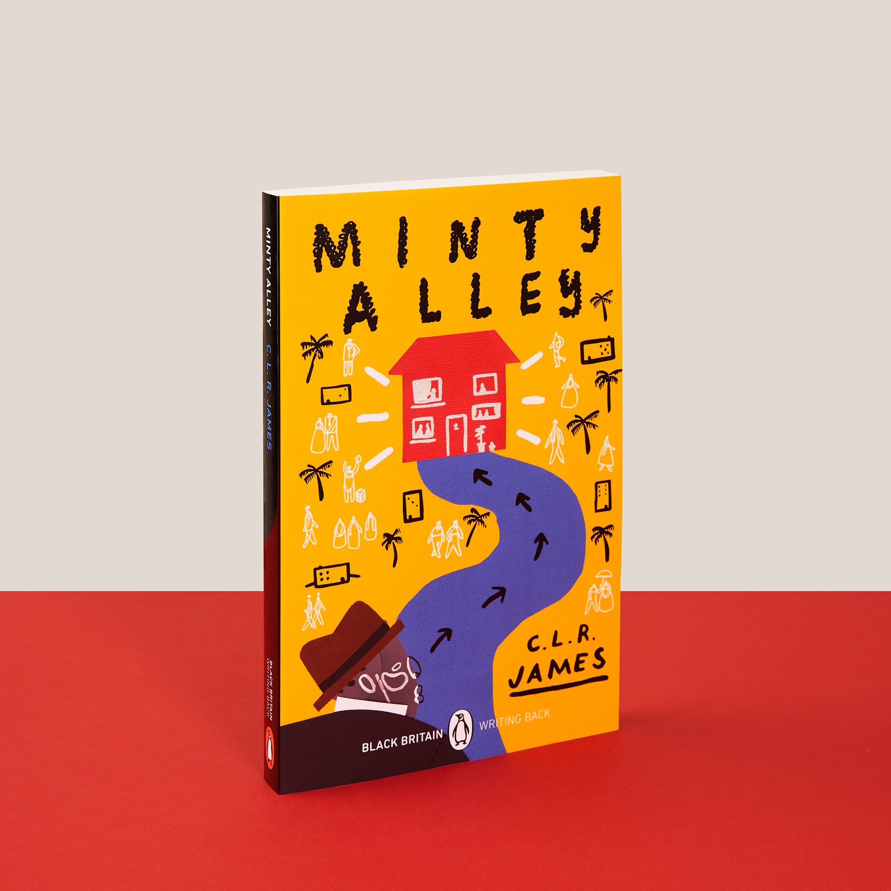
Joy Yamusangie’s cover for C.L.R. James’ 1936 novel Minty Alley – the oldest in the series – is bold and colourful.
“Minty Alley is set in 1930s Port of Spain, Trinidad, so it made sense to start my research there. I was particularly interested in men’s styling from this era: the wide brimmed hats, the loose suits and shiny shoes. At the time I happened to be re-watching Desmond’s on Netflix, and though this is set in London, I noticed the similarities in the styling and so his look became part of the inspiration, too. I knew from the beginning I wanted to show the face of the main character of the book, Mr. Hayne, and to convey the vibrancy of the story through bright colours.”
“The illustration for the Minty Alley cover is made from paper cut-outs; I have these loose sheets of paper of all the different elements and all their different versions like a striped suit, a white hat, a round house etc. After scanning it all, the making process became like a digital collage trying to piece all of the layers together.”
Yamusangie has worked “on a range of illustration projects, but this is actually my first book cover. Though we are advised against judging a book by its cover, design and illustration have the power to encourage people to start reading. It doesn’t need to be colourful but it needs to be clever in giving you a glimpse of the story, and hopefully provide some intrigue.”
What did you think of this article? Email editor@penguinrandomhouse.co.uk and let us know.
Image: Stuart Simpson / Penguin