- Home |
- Search Results |
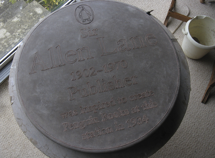
- Jim Stoddart, Penguin Press Art Director, on designing Sir Allen Lane’s plaque

Tell us about the creative process behind creating the plaque for Sir Allen Lane. What were your typographical inspirations?
Jim Stoddart: I was really honoured to have been involved with this project. In setting the text layout on the plaque the key thing was to echo the classic blue plaques, made by the same people, Sue and Frank Ashworth. Though with the Sir Allen Lane plaque it made sense that the typeface was Sabon, a font designed by one of Sir Allen Lane’s favourite designers, Jan Tschichold in 1967.
And it was lovely to see the Penguin logo rendered in ceramic and glaze too. Sue and Frank have done a lovely job.
Here’s a pic pre-glaze…
How has Sir Allen Lane’s legacy of ‘the paperback revolution’ informed your time as Art Director at Penguin Press?
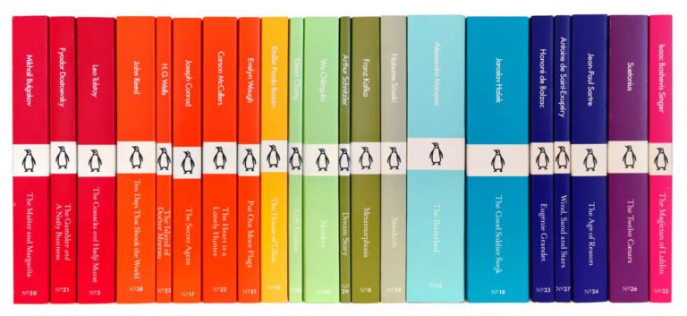
JS: The creative innovation and courage of Sir Allen Lane is something that resonates with the whole team, particularly his mission of making great writing available to a wide audience. We’ve been privileged to design recent series such as Pocket Penguins – colourful classics for everybody and Little Black Classics that celebrated our 80th Birthday and cost just 80p. Series like that are direct descendants of series Sir Allen Lane originally set up, the same DNA and the same ambitions (and colour-coding).
What do you think Sir Allen Lane would most admire at Penguin Random House today?
JS: The challenge is always to bring great writing to more people. I’m really proud of the way we’ve updated the brand by keeping a strong design component across our award-winning physical and digital products and it’s great to get recognition for that.