- Home |
- Search Results |
- Designing Penguin Modern Classics (Part 2)
In July 1981, the Penguin Modern Classics series was given a completely different look, by the new Art Director, Cherriwyn Magill. The books were larger: they had orange-and-white spines and white covers with an inset artwork, centred title and a Penguin logo perched below the overarching series name. In his book Penguin By Design, the critic Phil Baines describes this period, from a design point of view, as ‘the all-time low’.
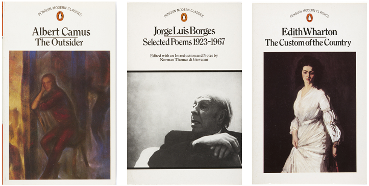
The series got its next face-lift in May 1989. It was renamed ‘Twentieth-Century Classics’ and the back cover and spine became bright blue-green. Striking black and white photographs filled the front covers, with a floating Penguin logo in its own roundel and a moveable white title box with text in Sabon.
Sabon was designed by Jan Tschichold, the legendary Penguin typographer who preceded Hans Schmoller. Tschichold had been extremely influential at Penguin in the late 1940s, standardising in-house design and typography with a set of Penguin Compositional Rules. He based Sabon on a 15th-century French typeface by Claude Garamond.
As always, bold cover artwork was the principle feature of the Modern Classics design, and in January 1990 coloured images were added to the series. The design remained unchanged for the next decade.
With the arrival of the new millennium, however, the Twentieth-Century Classics required a new name.
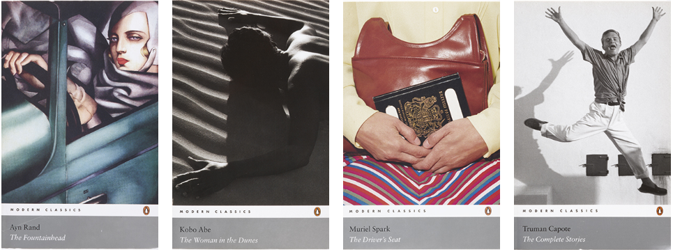
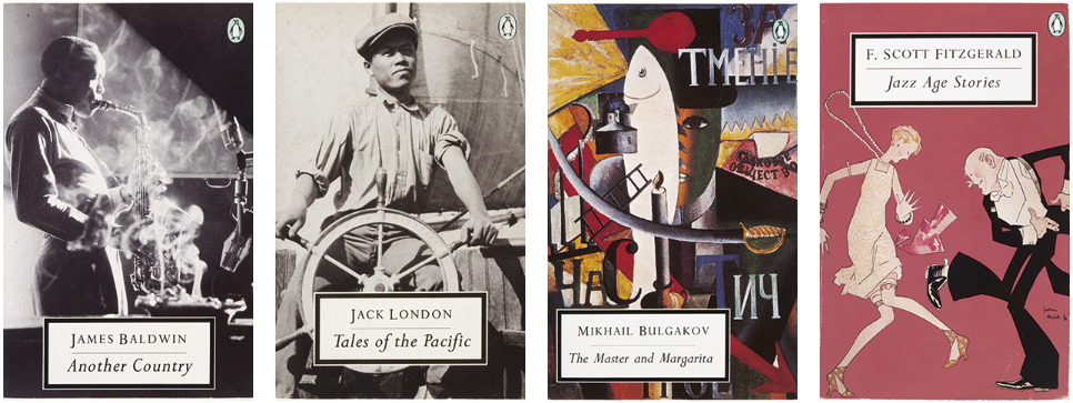
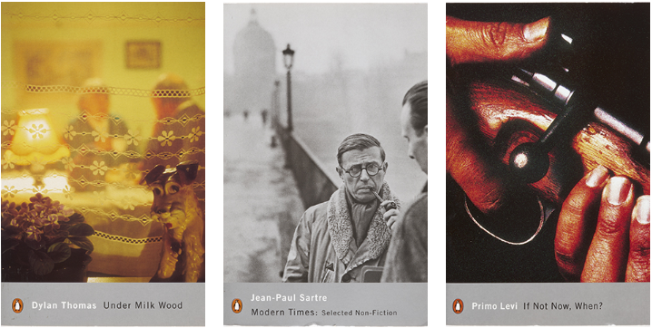
In February 2000, under the supervision of Pascal Hutton, Art Director at Penguin Press, the series reverted to its original name, Penguin Modern Classics, and was given a new look by the designer Jamie Keenan.
The back cover and spines became glossy silver and the book title and author’s name were moved into a silver panel. Keenan’s intention was to use a variety of typefaces on the cover, but in practice only three were used: Franklin Gothic, Trade Gothic and Clarendon.
All three have American associations: Franklin Gothic and Trade Gothic were both created in the States, in 1902 and 1948 respectively, ‘gothic’ being an early 20th-century term for sans-serif. Clarendon is a thick, serif, 19th-century typeface, designed in London, commonly associated with ‘wanted’ posters from the American Old West.
Keenan’s design was refined in January 2004: a white band was added, running between the silver panel and the cover image, containing the Penguin logo and the words ‘MODERN CLASSICS’. This reflected the new design of the Classics series, which had been introduced the previous year.