- Home |
- Search Results |
- The story behind the cover for The Race to Save the Romanovs
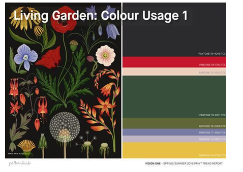
A rich palette of colours (though the design would not be at all floral) – golds; purples; greens; reds:
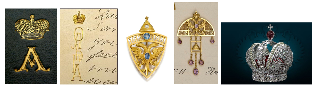
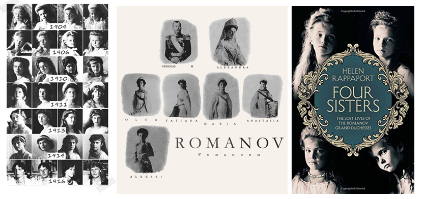
Scope to use images of the Romanovs, though the title/Romanov crown may be enough:
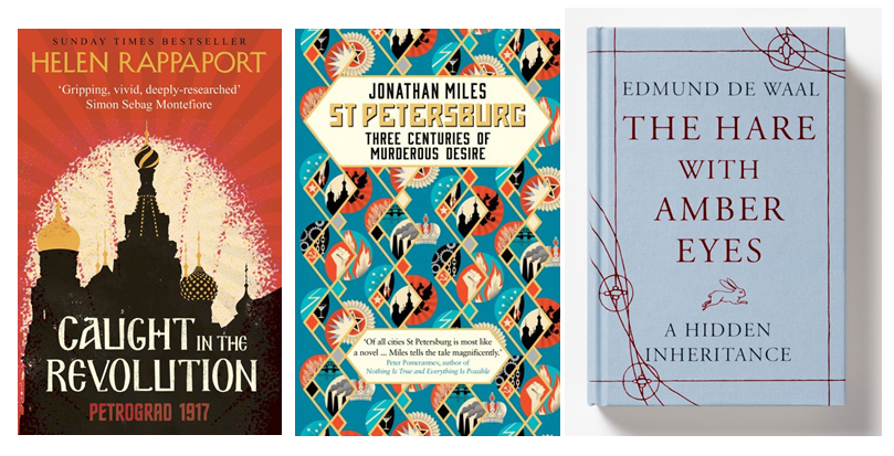
Potential for illustrative style in keeping with Helen’s previous book, Caught in the Revolution, to continue that theme (see also St Petersburg by Jonathan Miles). There could also be a framing component in order to hold the title/long subtitle (see The Hare with Amber Eyes):
Having discussed the first option with Helen, she was concerned that this might lead us to a cover that felt too whimsical or romantic in tone (this is the story of a race against time, after all), so we decided to pursue the second approach. I discussed possible illustrators and designers with our in-house designer, Emma Grey, and suggested La Boca, whose work is so striking and distinctive. They are also fabulous on typography, which is very helpful when you have a lot of words to fit into the fairly small rectangle that is a book cover...
Emma Grey, Penguin cover designer:
When I was first briefed to design the cover for The Race to Save the Romanovs, the original thought was to use a photograph of the family to be framed by an illustrated border. So, I created a very rough visual concept for this using an existing Russian frame – the idea being that we would have then briefed an illustrator to develop this direction:
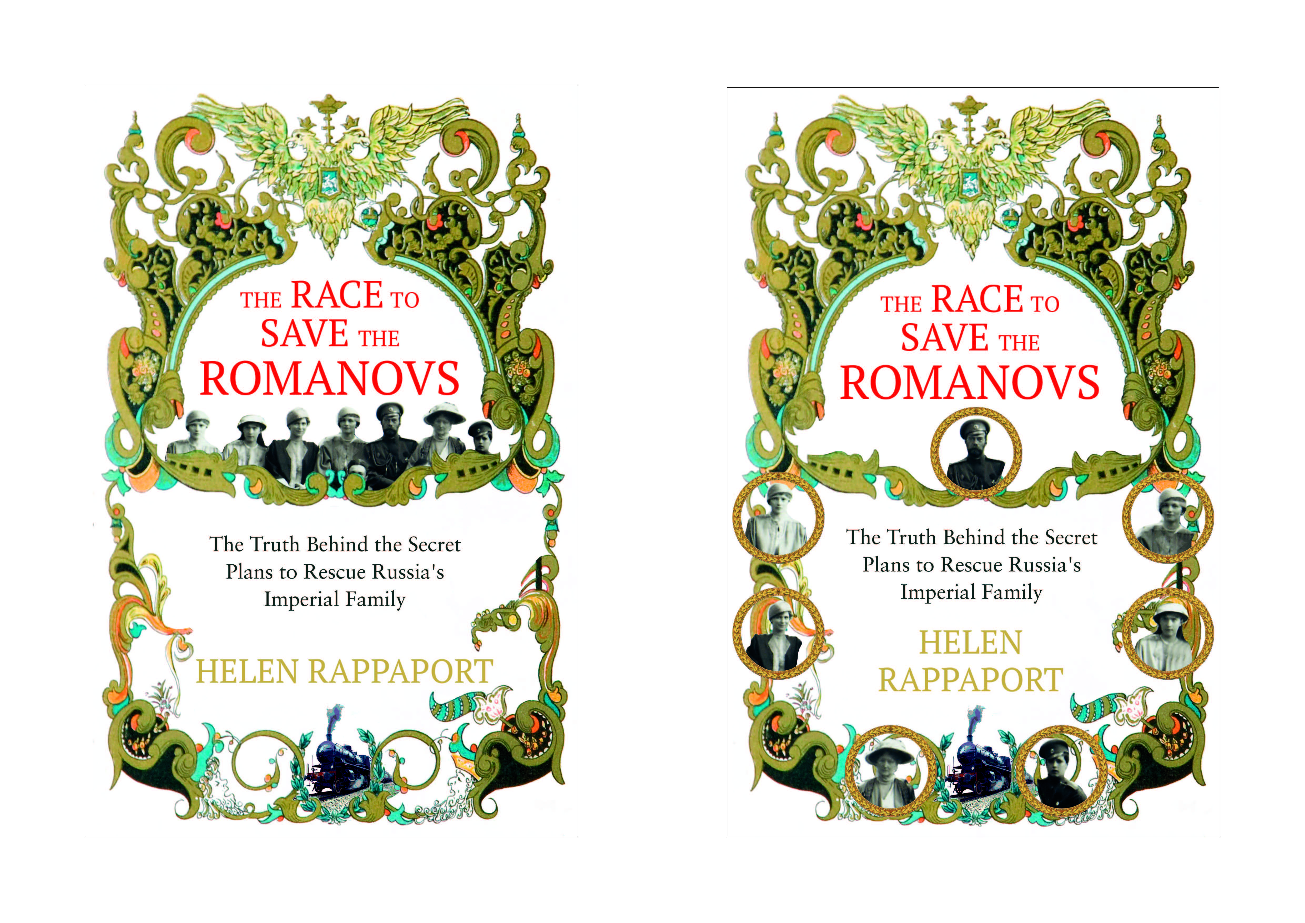
Although we all liked this idea in principle, Helen was concerned that this approach wouldn’t match the tone of her book.
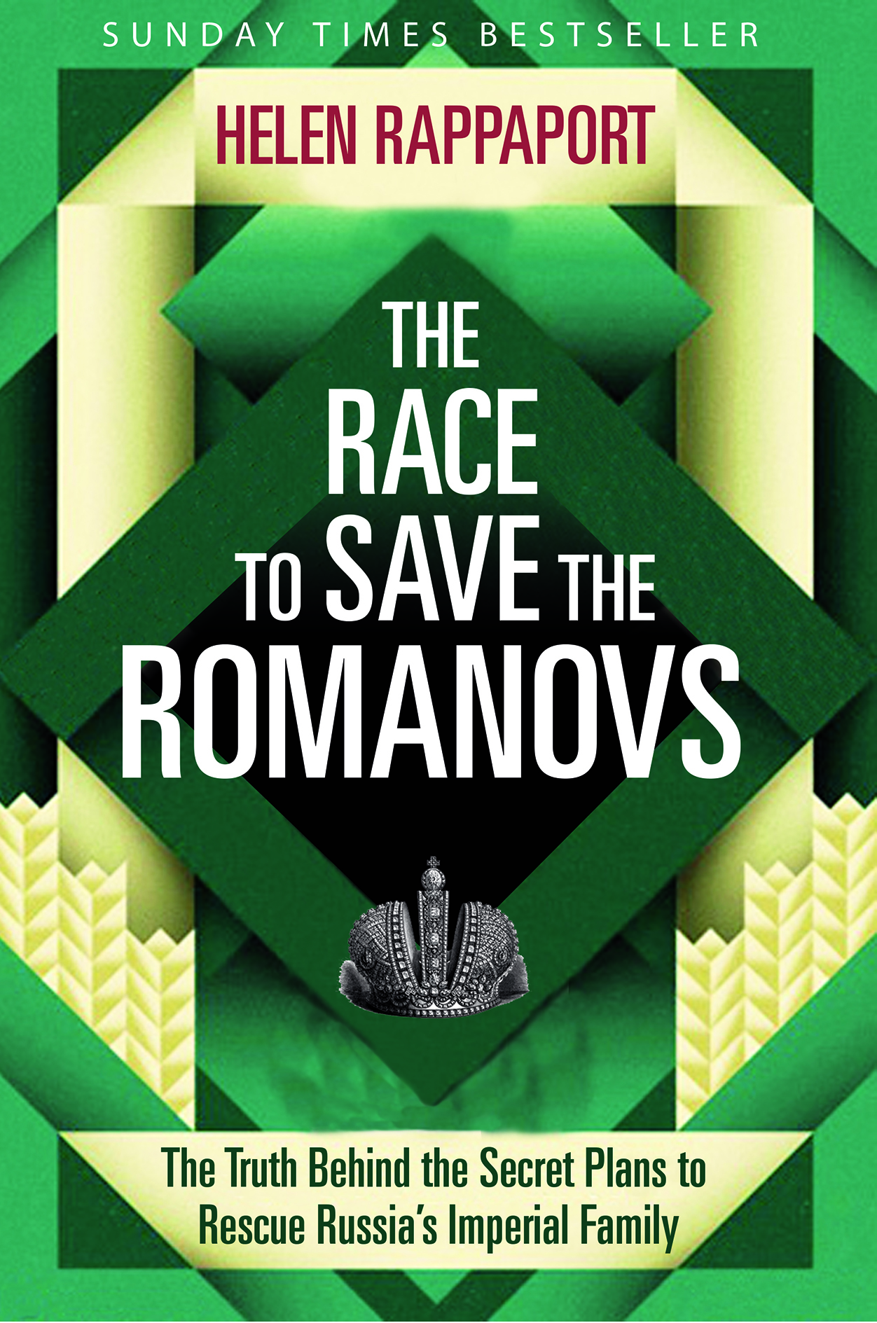
I then developed some ideas around train posters from the era (the Romanovs speed across frozen Siberia in a steam train) but we decided against going further with these as it was clear that, at a glance, readers would immediately think that these were ‘train books’. Not ideal.
After chatting with Sarah, we decided on a new direction incorporating a more graphic illustrated approach. We decided to approach the amazing team at La Boca, and I came up with this rough comp for them using some of their existing imagery, which encases the typography in a strong frame. I also wanted to add elements from the Romanov story, such as the crown or the crest – or even that speeding train – to the illustration.
You can see from the first stage of rough designs that the frame concept stood out and was an early winner for us:
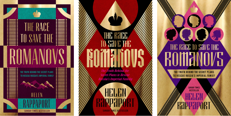
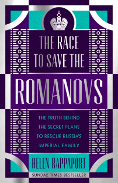
La Boca then developed two of these approaches further, giving more space to the subtitle and making the crown more detailed, which Helen was keen to have larger and in silvery tones. This was paired with deep rich royal purples and Romanov aqua green – as well as jewel-like details down the sides – to give us our final cover.
Helen Rappaport, author:
Having found the original filigree frame idea too fussy and twee for an investigative story with some hard-hitting content, I certainly thought La Boca were the right people to come up with a more forceful design. But I did worry at the beginning that their work might be a bit too ‘Soviet’ or ‘Art Deco’ in feel for the content of the book, which is set in 1918, at the end of empire/revolutionary period.
The traditional market for Romanov books can be rather conservative and people expect to see those seven famous faces on the front. However, I was by no means averse to the idea of not having them there. But the final design, whatever it was like, needed to shout ‘Romanovs’ to my target audience and the readership of my two previous Romanov books.
Thus, it all boiled down to choosing a powerful emblem for the cover that was an immediate visual marker for the Romanov fans. I felt that the twin-headed eagle of the first La Boca designs was too dark, too small – and that it has also become, perhaps, a rather over-worked icon. I much preferred the idea of a Romanov crown, but felt that it needed to be bigger and more detailed than in the earliest rough designs. This to me was absolutely essential if there was to be no photograph of the family. The other essential was choosing the right colour scheme. The original La Boca designs were very rich reds, golds and aubergines – certainly striking, but the wrong colours for the Russian content, and Soviet reds were a definite no-go. I suggested that we try Russian Imperial Purple – another important signifier for the target audience – and thought that this could meld beautifully with their silvery, diamond-encrusted Romanov crown. The turquoise was a lovely and unexpected addition!
I am thrilled with the end result. The La Boca design is modern, dynamic and looks stunning. I hope that book buyers think so too.