


What do you want to read?
Trending books
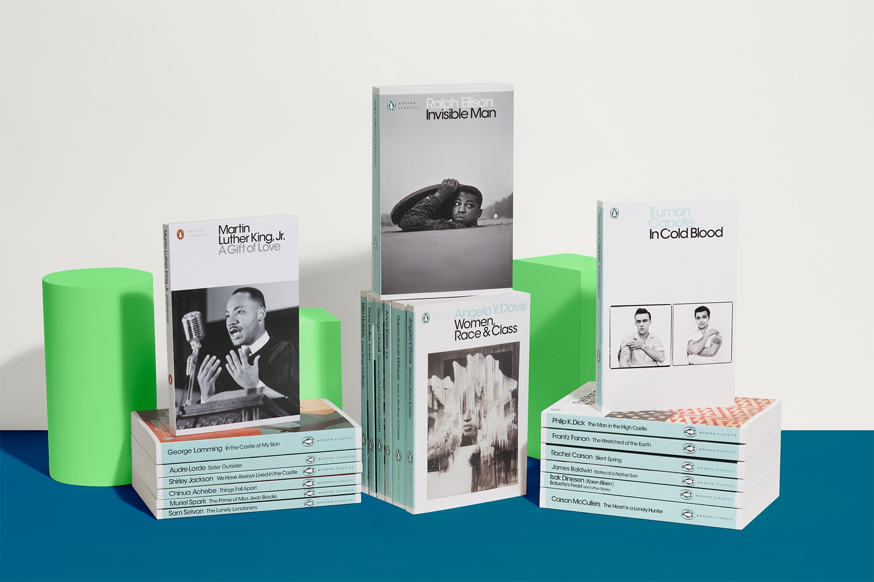
Penguin is home to the best authors of fiction, non-fiction and children's books.
We make books for everyone, because a book can change anyone.
Some time ago - in 1934, to be precise - our founder was waiting for a train and couldn't find anything good to read. What was needed, he realised, were quality books at a reasonable price. And so he decided to change things - the following year Penguin was launched, kickstarting a paperback revolution that would sweep the world.


Sign up to the Penguin newsletter
for the latest books, recommendations, author interviews and more
By signing up, I confirm that I'm over 16. To find out what personal data we collect and how we use it, including for our recommendations, please visit our Privacy Policy.
Penguin Shop
Browse our Penguin Shop online and discover a world of gifts and experiences to inspire and delight book lovers.