How George Orwell covers have evolved through the decades
On the 70th anniversary of the author's death we look back on the design work that brought his timeless novels to life.
‘The Penguin books are splendid value for sixpence,’ wrote George Orwell in March 1936, reviewing what was then the third batch of Penguin books, ‘so splendid that if other publishers had any sense they would combine against them and suppress them.’
Orwell began his association with Penguin Books in November 1940, one year into the Second World War, when ‘Shooting an Elephant’ appeared as the lead essay in the first volume of the Penguin New Writing series. It was followed in December 1940 Down and Out in Paris and London, which quickly sold out its initial print run of 55,000 copies, transforming Orwell’s reputation overnight.
For the last seventy years, Orwell has been Penguin’s bestselling author. His first novel, Burmese Days, joined the list in 1944 and his late masterpieces Animal Farm and Nineteen Eighty-Four followed in 1951 and 1954. Sinces the 1960s, his work has appeared as Penguin Modern Classics in various guises.
This 21 January marks the 70th anniversary of Orwell’s death, the perfect moment to reflect on eight decades of Penguin Orwell covers. Here is a selection of some of the best.
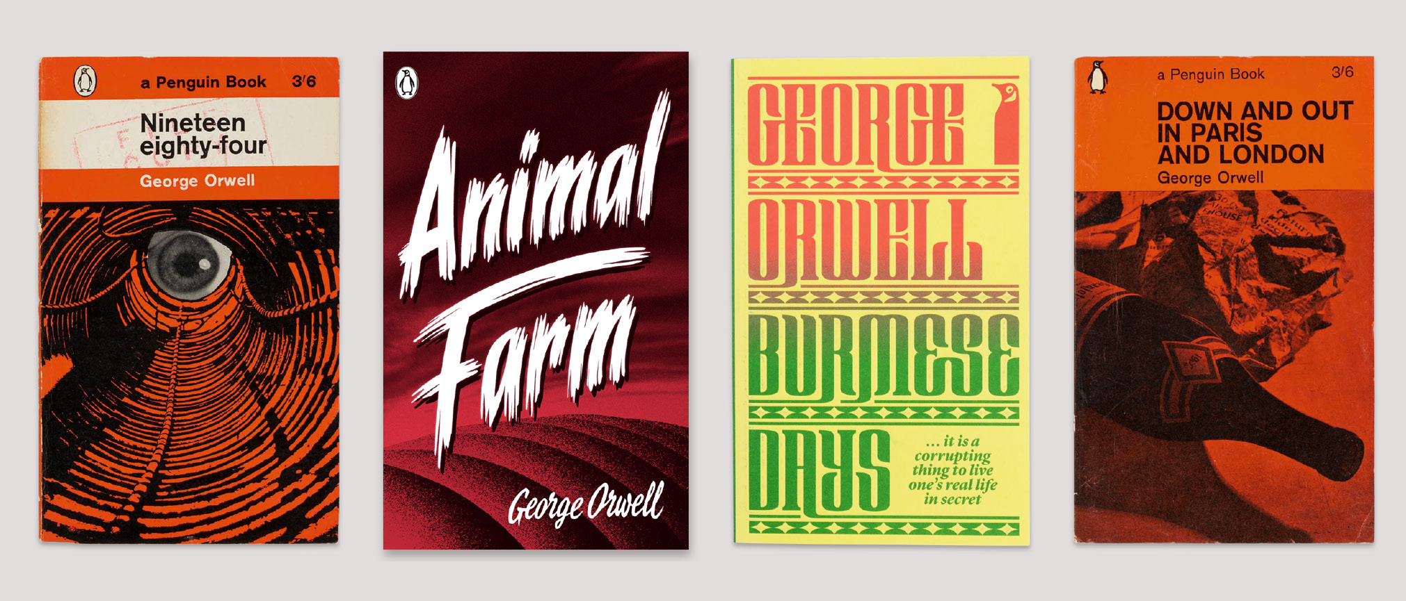
Animal Farm

1951.
The original Penguin ‘triband’ design was created in 1935 by Edward Young, Penguin’s first production manager, and refined in 1948 by the typographer Jan Tschichold.

1965.
Animal Farm was first published in the Modern Classics series in 1963, with this striking cover illustration by Paul Hogarth. This design uses the typeface Joanna, created by Eric Gill.

1989.
The Penguin Twentieth-Century Classics series was launched in 1989. This cover image is a detail from ‘Pig-Spread’ by the artist Ditz.

2009.
This cover was designed by Marion Deuchers, with the daubed slogan: ‘ALL ANIMALS ARE EQUAL BUT SOME ANIMALS ARE MORE EQUAL THAN OTHERS’.

2013.
The designer David Pearson created ten new covers for the Great Orwell series, which launched in 2013. Here he uses bold lettering in the style of a classic horror movie.

2018.
The designer Coralie Bickford-Smith created this cover as part of the revived Penguin English Library series, which began in 2012.
Burmese Days

1944.
The original Penguin ‘triband’ design was created by Edward Young in 1935. This edition has the livelier ‘dancing’ penguin logo and the orange cover indicates a work of fiction.

1989.
The Penguin Twentieth-Century Classics series was launched in 1989. This photograph comes from the India Office Library, now housed at the British Library in London.

2009.
The Modern Classics series was redesigned by Jim Stoddart in 2007. This image was created by Marion Deuchars and won the 2010 V&A Museum Book Cover Illustration Award.

2014.
The designer David Pearson created ten new covers for the Great Orwell series, which launched in 2013. Here he has redrawn the Penguin to match the strong serif typeface.
Down and Out in Paris and London

1962.
Down and Out was the first of Orwell’s books to be published by Penguin, in 1940. This reprint was designed by Germano Facetti, using an image from the firm Fletcher/Forbes/Gill.

1989.
The Penguin Twentieth-Century Classics series was launched in 1989. This photograph is a detail from ‘Behind the Restaurant’ by Bill Brandt.

2013.
The designer David Pearson recalls the ‘Marber Grid’ used on Penguin covers in the 1960s, and incorporates a screen print by Paul Catherall.
Nineteen Eighty-Four

1962.
This reprint of the first Penguin edition (1954) was designed by the Art Director Germano Facetti, using a photograph of Big Brother’s unblinking eyeball at the end of an illustrated tunnel.

1966.
This image is a detail from ‘The Control Room, Civil Defence Headquarters’ by William Roberts. The same image was used when Nineteen Eighty-Four joined the Modern Classics series in 1969.

1980.
The Penguin Orwell editions were given a new set of covers in 1980, with his name in bold lettering and the Penguin logo inside the O. This photograph is by Humphrey Sutton.

2000.
The Penguin Modern Classics series was redesigned by Jamie Keenan in 2000, with a slim silver panel below the image. This cover image is ‘Abstract Painting’ by Stephen Conroy.

2009.
The Modern Classics series was redesigned by Jim Stoddart in 2007. This cover image was created by Marion Deuchers, with graffiti numerals sprayed over the title.

2013.
On this Great Orwell edition, designer David Pearson erased the title and author’s name by overprinting with black foil, but you could read the debossed words with your fingertips.

2019.
This cover marks the first time that Orwell appears as a Penguin Black Classic. The cover image is ‘Self-Portrait’ by Francis Bacon.


