Animal Farm: How the covers have changed through the decades
Animal Farm didn’t always look like it would become a classic. George Orwell wrote the satire in the winter that spanned 1943 and 1944, when the British government was in wartime alliance with the Soviet Union against the Nazis. Orwell wasn’t a fan, and looked back to how the Russian Revolution of 1917 led to Stalin’s rule for inspiration. A lot of publishers were unkeen to touch the manuscript, and reviews were fairly lukewarm when Animal Farm did appear on bookshelves.
However, Orwell was once again shown to be prophetic. When relations broke down between the British government and the Soviet Union in anticipation of the Cold War, Animal Farm experienced a huge swell in popularity. From then on, the satire has been considered one of the greatest books of the 20th century, finding fans and sparking minds in each generation – often with a new cover design. Seventy-five years after the book’s publication, we celebrate the changing face of Animal Farm.
1951

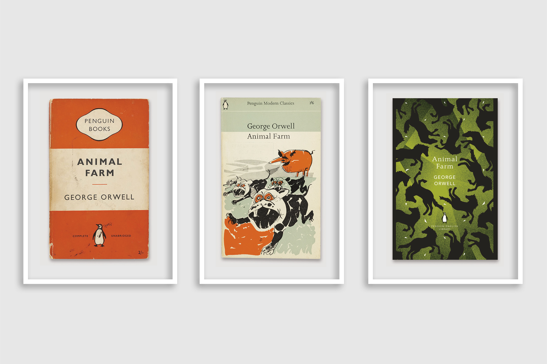
Penguin’s first Animal Farm cover arrived six years after the book itself, when – like many other future classics – it earned its orange stripes in the form of the original “triband” design. Edward Young created the now-iconic, and increasingly oft-applied, cover in 1935, but it was Bauhahus typographer Jan Tschichold who refined it in 1948 after becoming Penguin’s head of typography and production in the late Forties. With it, Animal Farm became part of the Penguin fold.
1963
A decade later and the Penguin Modern Classics series was launched, giving a host of 20th-century reads a fresh new look using the Joanna typeface, designed by Eric Gill. Two years later and Animal Farm joined the pack, with a scratchy, energetic illustration of a dictatorial pig (Napoleon, one suggests) scaring the living daylights out of some frantic dogs. This was the work of Paul Hogarth, a reportage artist who blended his skills for documentary with a love of literature, collaborating with Graham Greene and Doris Lessing. It’s intriguing that he should illustrate Animal Farm: Hogarth was committed to the radical Left, which saw him travel to Communist states such as China and the USSR in the 1950s.

1970

By the Seventies Penguin Modern Classics had undergone its first makeover: a slick, black design with a painting by Joan Miró on the cover. ‘The Tilled Field’ was painted half a century before, inspired by the artist’s family farm in Catalonia. The cover doesn’t use the whole of Miró’s artwork, but that it does frame shows an abstracted version of familiar farm iconography – a barn, a horse, some animal-like creatures – along with, in the top right-hand corner, a strangely omniscient eye.
1989

Animal Farm got a new treatment in the late Eighties, becoming part of the Penguin Twentieth-Century Classics series. With it, Orwell’s otherworldly farm received its most representative cover yet: an almost homely drift of pigs of different varieties, snuffling about quite happily. This was taken from the painting Pig-Spread, painted in by the artist Ditz.
2000

With the modernity of the millennium, Penguin Modern Classics turned silver. Animal Farm had a revamp with a new introduction by Malcolm Bradbury, and the pigs harked back to Hogarth’s day, dropping the cuteness of Ditz’s cover art and taking a far more political stance, standing bullishly against a red star.
2009

Designer Marion Deuchers had further abstracted and layered the cover design at the end of the decade. Chicken and coop imagery is just visible behind an opaque red, with a chink of light given over to a commanding pink pig and some distant birds. At the top, some of Animal Farm’s best-known lines are scrawled, graffiti-like, in Deuchers’ distinct handwriting: “All animals are equal, but some are more equal than others”. The animosity was back.
2013

Four years later saw the launch of the Great Orwell series, which saw re-imagined versions of Orwell classics being published alongside essays the author had previously deemed “too libellous to print”. Designer Dan Pearson created a 10 decidedly different new covers for the books, and Animal Farm received the Hollywood treatment with a cover that uses lettering inspired by the titles of old horror films.
2016

Animal Farm received the clothbound treatment in the mid-2010s as part of Coralie Bickford-Smith's re-invention of Penguin classics. The design saw the Orwell book turn green for the first time, after decades of red colour palettes, and also saw a new animal brought to the fold: eerily tumbling horses against a mysterious background glare.
2020

Coralie Bickford-Smith re-invented Animal Farm once more with the turn of a new decade. Picking up on the red-and-black colour scheme of many earlier versions of the cover, Smith’s version has a notable omission: animals. “I just used pen fences,” she told Penguin.co.uk, “So simple.” The new clothbound, hardback version is striking, captivating and a little unerring – just like the book itself.
What did you think of this article? Let us know at editor@penguinrandomhouse.co.uk for a chance to appear in our reader’s letter page.