Pinks, layers and bold fonts: the book cover trends that have dominated 2021
Book cover design is as subject to trends as interiors or fashion, and this year has been no different. Here Penguin designers discuss the biggest covers of 2021 - and what we can expect on our shelves next.
What books have you read this year? If you were to, say, put them face-up on a table, what might you see? A proliferation of pink, or a swing towards green, perhaps. Maybe your attention will be caught by a typeface you just can’t ignore. Or perhaps there’s a cover that’s just so beautiful you’d like to see it without the text entirely, and just put it on your wall.
These are among the shifts we’ve seen on our shelves over the past couple of years that have led to a new trend of covers in 2021. After a year when bookshops were more closed than they were open, and with more people buying books online than ever before, it’s never been more essential for a book’s cover to be arresting, intriguing or delicious to look at, particularly in our feeds.
We spoke to three of Penguin’s designers, Loulou Clark, Art Director at Ebury; Becca Wright, Senior Marketing Designer at Cornerstone and Beci Kelly, Head of Design at Doubleday, about why 2021’s books look like they do - and what we can expect from 2022.
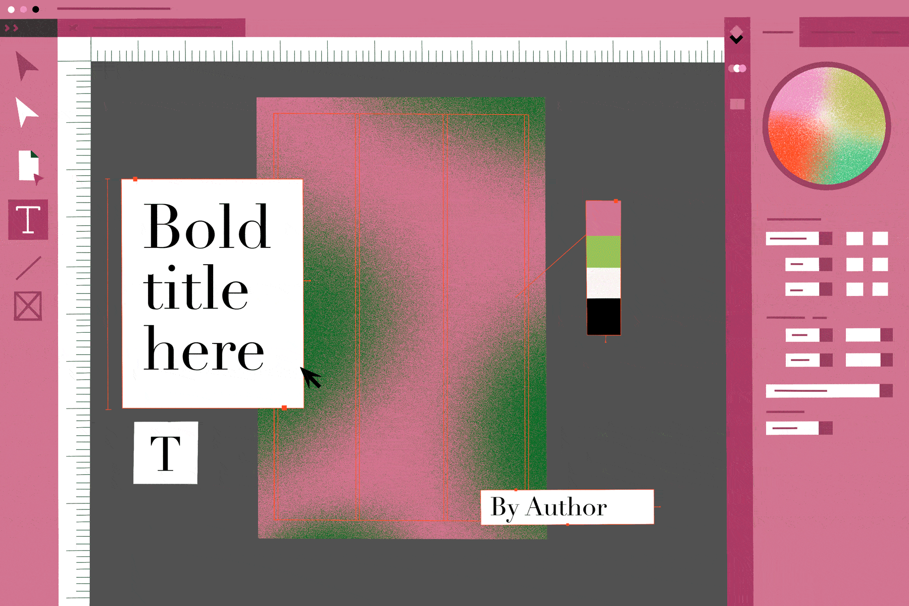
Trend one: Super-keen for pink and green

In the summer of 2020, Pandora Sykes’ debut book, How Do We Know We’re Doing it Right, hit the shelves and The Sunday Times bestseller list. It also kickstarted a design trend. Both Clark and Wright cite its bold cover - a wobbly, dark pink square against a dark green background, with serif font spelling out the author and title - as the origin of a flurry of books that play with bold colours, in particular pink and green.
“There’s long been this myth in publishing that green books don’t sell,” explains Clark. “If you have a jackets meeting, and present four different-coloured covers, nobody ever goes for the green. But it’s been huge this year, and I’ve really enjoyed finally seeing green everywhere!” The move has been particularly popular for non-fiction books. Anna Mathur’s Know Your Worth, released in May, looks like a little sister to How Do We Know We’re Doing it Right, while in June Miranda Levy’s The Insomnia Diaries put a green rectangle against a pink background, creating a negative of Sykes’ cover. In September, Comrades by Rosita Boland completed a triumvirate of covers that played with bold shapes in pink and green.
It’s a trend, Clark says, that’s particularly popular among non-fiction books. Green has been a feature colour for Fran Bailey’s The Healing Power of Plants, teamed with blush, and on The Self-Care Cookbook by Gemma Ogston, where it is matched with lilac. Ogston’s isn’t the only cookbook to go green: Ching He-Huang’s Asian Green, Afro Vegan by Zoe Alakija and the anniversary edition of Sally Butcher’s Veggistan have also followed the colour palette. It’s notable that only one of these titles feature a photograph of food, and even then, it’s stylishly encased within a clean square. “Cookbooks have been very cool and graphic rather than overly complex or showing the traditional picture of one dish on the front,” says Kelly. “It’s a shift that makes a cookbook more desirable as a highly coveted object to collect, as well as being very Instagramable”.
Trend two: lots of layers

Designers highlighted how 2021 has been defined by covers that feature layers and patterns. “Rough layering and abstract shapes have been carried through a lot of designs,” says Wright. “They leave a bit to the imagination when it comes to the context of the book.”
“I think the origin of this one was [Glennon Doyle’s] Untamed, where we saw these abstract patterns and texture with glitter,” adds Clark. “We say that again with Fearne Cotton’s book, Speak Your Truth, with layers of pink.” Clark also cites Matt Haig’s The Comfort Book, from July - which, like, features a sun on the cover - and Poorna Bell’s Stronger, released in April, which revolves around a lightning bolt. “Sun and lightning bolts I think have been massive,” she adds. Laura Whitmore’s No One Can Change Your Life Except For You, which came out in March, combines all three: a gold cover with layers of colour at the bottom, interrupted by a lightning bolt.
Why are these so popular? Clark thinks it reflects what we’ve been through. “There’s been a real kind of want for sort of symbols of strength for thing because everyone's still sort of trying to power through this pandemic” she says. “I think people have been craving, joy and fun and we've definitely seen that in design trends.”
They’re also very pleasing to look at, as Wright points out. “A big part of the popularity is that a lot of these covers, if you removed the titles, they could be a piece of art on the wall. And that’s quite appealing if you go into a bookstore to look at these covers that feel like art.”
Trend three: bold type

All of our designers were agreed: titles and author names have had a big - and bold - year. “I’ve noticed lots of extra bold, very in-your-face large type, drawing the eye in and making a clear prominence and legibility online,” says Kelly. Wright also reflected on the use of “very bold, in-your-face typography”. Cover typefaces varied, however, landing in two firm camps: “There’s either been really clean, minimal sans serif, Helvetica-type fonts, with lots of space for strong impact in a quite minimal way,” says Clark, “or people are doing really chunky, serif fonts.”
“There was a resurgence in the retro-feeling serifs, with extra curlicue flourishes, brought on by trends further afield crossing over from both fashion and interior design trends alike,” agrees Wright. It’s an approach taken by Anna Morrison, who designed the cover for Conversations on Love by Natasha Lunn, which relied on the book’s title alone for a cover. The Best, Most Awful Job, a collection of essays edited by Katherine May and released in August, put bold, black text first while Ottolenghi Test Kitchen just placed type on a plain background in two shades of pink.
What’s next? Trends for 2022
Kelly, Wright and Clark all agreed that book cover design, much like interiors and fashion, trends are cyclical, and some, such as stark typefaces, weren’t going anywhere soon. However, they are likely to evolve next year. For instance, type, says Kelly, may shift to something more human after a few graphic years: “I would imagine that some more handwritten and experimentative type will surface again, to break through as a bit of a point of difference.”
Having seen an increase in photography use in cover designs as the year has gone on, Wright sees more in our future, citing Yoko Ogawa’s The Memory Police and The Rib King by Ladee Hubbard as a starting point. “It’s very contemporary, and I think the story feels a bit more deeply personal when there’s photography on the cover,” she says. “Book covers have been in such an illustrative place that I wonder if photographic design will come back into play,” predicts Clark. Wright agrees: “I have an inkling that collaged images might be a bit of a trend - not a new one - but realistically, like most areas of design, trends tend to repeat themselves and come back around.”
What did you think of this article? Email editor@penguinrandomhouse.co.uk and let us know.
Image: Alexandra Francis for Penguin