We learn early not to judge books by their covers, but what about their spines? When it comes to how a book looks and feels, it’s easy to forget about the thought that has gone into making a book stand out in its permanent home – your bookshelf. So we spoke to experts from across Penguin Random House about what makes a good book backbone.
'Aim for one wow factor'
Amy Musgrave Designer at Cornerstone
'Penguin made the blueprint'
Thomas Birkhead Archivist at the Penguin Archives
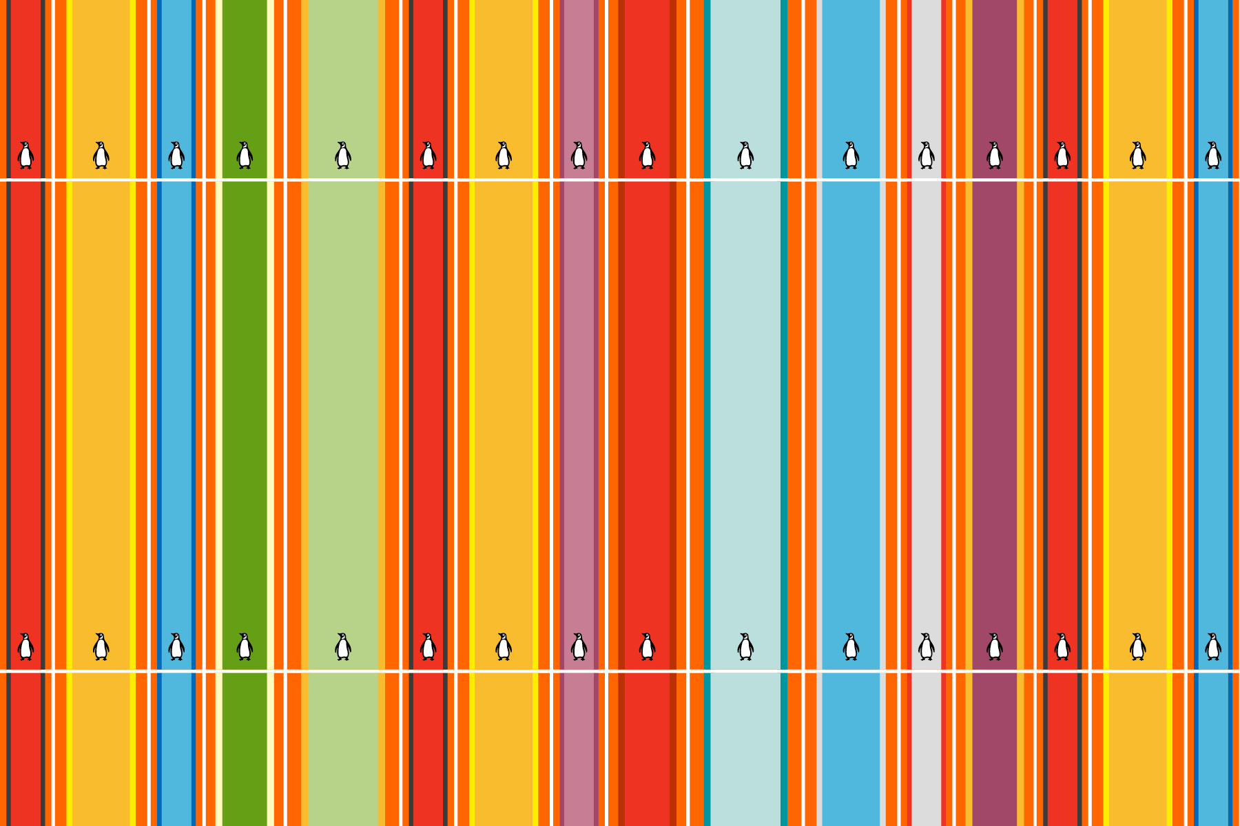
Originally, spines weren’t really that much of a consideration because just having a bunch of hardback books meant that you were a cultured person, and so it didn’t really matter what it said on the spines or if you could read it. The lettering was generally always horizontal. But with the rise of paperbacks - and Penguin was a big thing for this - the lettering started going vertically rather than horizontally and the publishers started to pay a little more attention to the design of them.
The Penguin paperback got the set up very clearly: the colour denoted what genre it was, and you’ve got the number of where it would sit in the main series, the Penguin colophon and the title and the author. So that was kind of the blueprint, and it’s held up if only as how to do them right, because it just does exactly what you need it to.
Things changed, and you start to get more design emphasis on spines. In the 1960s and Seventies, Penguin were doing sci-fi titles with wraparound cover images. Whenever I see the sliver of the image I’ll always hoik it off the shelf to see the full picture. But something like the Penguin Poetry Paperbacks have always stood out for me because they have that beautiful patterning carried through to the spine carried through to the covers. That kind of thing is always nice.
'It has to convince you to pull the book off the shelf'
Anna Billson Art Director, Penguin Random House Children’s
'There’s not much more satisfying than a selection of a nicely put-together spines'
Luke Bird External designer, Vintage
'You can create a visual story'
Marianne Issa El Khoury Designer, Transworld
One of the joys of designing a spine is finding ways to modify and reinterpret the front cover onto the spine; to create something that is different enough but gives enough visual cues to be linked to the front. This can be done by reversing the colours from the front, or adjusting a pattern. Changing elements just enough that it complements the aesthetic of the front while still being different.
A designer can even create a visual story through the design of the whole cover (from back cover, spine and front cover). If the front cover has elements that denote time or a portion of a character’s journey, the designer can be playful and depict the next portion of the journey on the spine and the last portion on the back. Making the reader discover something new with every glance of the jacket.
You know you have done your job right the longer someone holds and looks at a book.
The Penguin Student Design Award aims to discover and nurture the next generation of design and illustration talent. Experience a real cover design brief first-hand with our 2021 titles from Benjamin Zephaniah, Meera Syal and David Wallace Wells. Submissions close on 23rd March.