The book covers that almost were
Every book jacket exists in multiple versions that the world never sees before a winner is finally picked and delivered to shelves.
Here, Penguin Random House designers share their favourite nearly-covers from some of the most popular books of recent years, and explain the process behind the magic.
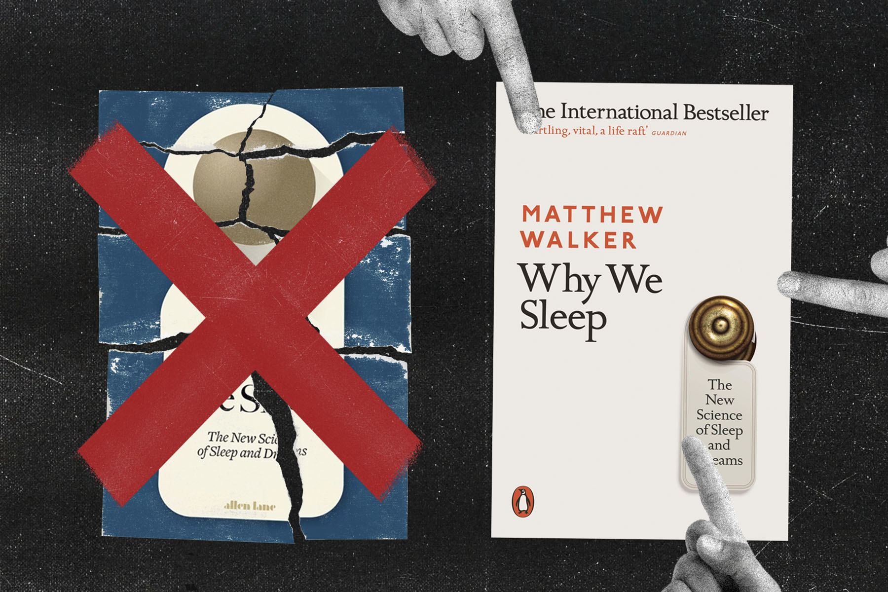
Why We Sleep by Matthew Walker

Chosen by Isabelle De Cat, Designer at Penguin Press
Why We Sleep is a ground-breaking non-fiction looking at sleep and dreams.
"There was a lot of excitement around the manuscript of Why We Sleep and with good reason: it truly is a life-changing read. To make our edition stand out in a fairly overpublished area, we needed to avoid the ubiquitous pillows, duvets and other night scenes.
It took three rounds of visuals before arriving at a solution that would make everybody happy: the ‘Do Not Disturb’ sign, an object peripheral to sleep but still signalling it. A few weeks later, the first cover proofs came in, the metallic pantone of the door knob worked nicely on the uncoated paper stock, all looked really good…. And then everything changed! After a brilliant talk given by the author at a Penguin event, the cover was yet again re-briefed. The more iconographic approach of the original design was toned right down in favour of a greater focus on the author’s name."
Djinn Patrol on the Purple Line by Deepa Anappara

Chosen by Kish Rajani, Middleweight Designer and Etta Voorsanger-Brill, Junior Designer at VINTAGE
Djinn Patrol on the Purple Line is a debut novel about boy in India searching for his missing friend.
"For the hardback of Djinn Patrol on the Purple Line, VINTAGE Art Director Suzanne Dean was looking at lots of different approaches – from photography, collage and illustration, as well as taking inspiration from Indian sign painting and beautiful matchbox imagery alongside the rich application of colours - ultimately leading to the final hardback cover design.
One of the unused covers from this selection included use of Dimpy Bhalotia’s Mumbai street photography of kids. Her images resonated well with the novel’s energy, as well as the protagonists that inhabit it. This was the stepping stone, and key inspiration for the paperback, which took many forms playing with layout and design of Dimpy’s photography. Ultimately, we referenced back to the impactful colours and style of Indian sign painting, and combined it with Dimpy’s energetic photography to create the paperback version.”
Taking Up Space by Chelsea Kwakye and Ore Ogunbiyi

Chosen by Amy Musgrave, Designer at Cornerstone
Taking Up Space is a manifesto for tackling racial inequality written by two Cambridge graduates.
"The initial idea for Taking Up Space was to have a bright, classy cover with a small nod to university incorporated in the design. We tried a few ideas involving scrolls and crests but the one that sat most naturally was the graduation cap over the ‘i’.
This visual was eventually moved on because whilst it was bright and had a really elegant font for the title, we wanted the cover to have more impact and to live up to its title by ‘taking up’ more of the cover. The graduation cap icon was also removed, as the new direction of filling the cover with the title was much stronger solely with type – trying to fit any images into the design would only take away from it.
Everyone loved this style font though, and in the end we did keep a small part of it for ‘up’. There’s always something a bit more personal about a cover with handwritten style type, and this cover from the beginning felt like it needed that.”
Moonflower Murders by Anthony Horowitz

Chosen by Glenn O’Neill, Associate Art Director at Cornerstone
Moonflower Murders is an intricate thriller by an international best-selling author.
"The initial design proposals for Moonflower Murders were various graphic depictions of moonflowers incorporating spots of blood. However, this direction wasn’t considered leading to a sufficiently lyrical solution, and considering it was a thriller, it lacked menace.
Next were depictions of a derelict lighthouse and a design featuring a hotel described in the narrative. Neither approach had any traction in our weekly design meeting – by now though the typography was settled, with the author branding decided using a typeface, ‘Revolution’, where ‘Anthony’ and ‘Horowitz’ set satisfyingly to the same length.
Finally, I tried some rough illustrations of swooping owls in an atmospheric night scene, which found favour with our design meeting, and then also with the author and his agent. I then commissioned illustrator Sinem Erkas to complete the cover, which is what we see today."
When the Lights Go Out by Carys Bray

Chosen by Ceara Elliot, Senior Designer at Cornerstone
When The Lights Goes Out is a satirical novel examining family and relationships.
"This was briefed as a book about marriage, but also climate change. From the start I had some lovely imagery to work with from the text; water, smoke, nature and candlelight to name a few. I loved throwing these around the page, exploring dark and earthy colours, abnormal layouts and various textures.
Initially the house with the smoke cloud was considered as being the right visual to pursue, but after discussions it was decided it felt a little cold, dark and lonely, and didn’t obviously portray global warming. The one that was chosen to be taken further, had the same domestic element (the house), which felt crucial to the book, along with a stronger nod to climate change represented through rising water levels, slowly drowning the title.
I commissioned James Weston Lewis to illustrate the cover and create a full jacket to wrap around the book. The textures and colours used evoked a little more warmth to the cover that was needed to ensure it communicated that ray of hopefulness. In most cases, the decisions made around cover choice, though at the time may seem frustrating, end up being for the right reasons. The covers that don’t make it aren’t lost, and in the case of this book, they can always be recycled and reused."
Miss Benson’s Beetle by Rachel Joyce

Chosen by Richard Ogle, Art Director at Transworld
Miss Benson’s Beetle is an uplifting novel about female friendship.
"At the time of designing, the book wasn’t even called Miss Benson’s Beetle. At one point it was called The Glory of Margery Benson and, at another, Margery Benson’s Awfully Big Adventure. Based on the premise of a big adventure, with only sample chapters available, we felt that travel posters of the 1950s (the decade the book is set) was a good cultural hook to hang the jacket on. We commissioned Neil Gower who illustrated a bold map concept with suitcases representing the two female protagonists.
However, as more chapters were supplied, it was felt that this was a much deeper, emotional book than the quirky, fun map idea portrayed. We changed tack and recommissioned Neil to redo the cover in a new style he’d recently developed to illustrate a book called As Kingfishers Catch Fire. The richness and aspirational pitch of these illustrations better suited the unfolding novel’s direction. The result, we felt, represented the more aspirational heart of the novel.”
Knee Deep in Life by Laura Belbin

Chosen by Loulou Clark, Art Director at Ebury
Knee Deep in Life is a memoir about motherhood.
"Targeting Laura’s core online audience, this cover was briefed to convey her humour and personality through the use of bright colours, following the trend of type-led designs. We saw lots of great energetic designs throughout the process but as it evolved, we felt it lacked what Knee Deep in Life was known for – Laura’s hilarious photos. We developed the designs to include photography, first trying a confident single image approach, paired with contemporary colour palettes and bold typography, but later settling on a strip of three images, which reflected more of a snap shot of her Instagram feed.
It can be tough rejecting great designs, but more than achieving just an attractive cover, we must ensure we communicate the content in an immediate and dynamic way. This book went on to be a Sunday Times Bestseller.”
Rough Magic by Lara Prior-Palmer

Chosen by Loulou Clark, Art Director at Ebury
Rough Magic is a novel about the world's toughest horse race.
“The challenge here was finding the tone for the paperback to reach the right audience. As a book about extreme landscapes, it was initially briefed to pursue an illustrative route – similar to the hardback, sitting firmly in the nature writing space with beautiful foil finishes for a covetable package, exuding the magic of the writing.
However, when reviews of the book focussed on how compelling the author’s personal narrative was, we questioned whether the lack of a figure reflected the memoir aspect of the book clearly enough. It was when Rough Magic was selected for the Richard & Judy Book club that we decided to review the whole approach.
Driven by the opportunity of this new platform and slight shift in audience, and listening to retailer feedback, we considered photographic designs that would depict the journey the author took, and were able to source the perfect image. The dramatic skyline and silhouetted horses solved our previous concern, drawing the reader into the image and setting without the need for a human figure. With this image, the design suddenly fell beautifully into place and the book led on to great success.”