- Home |
- Search Results |
- Clothbound Classics: how a Victorian-inspired books experiment broke the internet
Clothbound Classics: how a Victorian-inspired books experiment broke the internet
Fourteen years ago, the Clothbound Classics revolutionised how the canon looks. As the Little Clothbound Classics launch a new series, Alice Vincent reports on how they bucked tradition – and won.


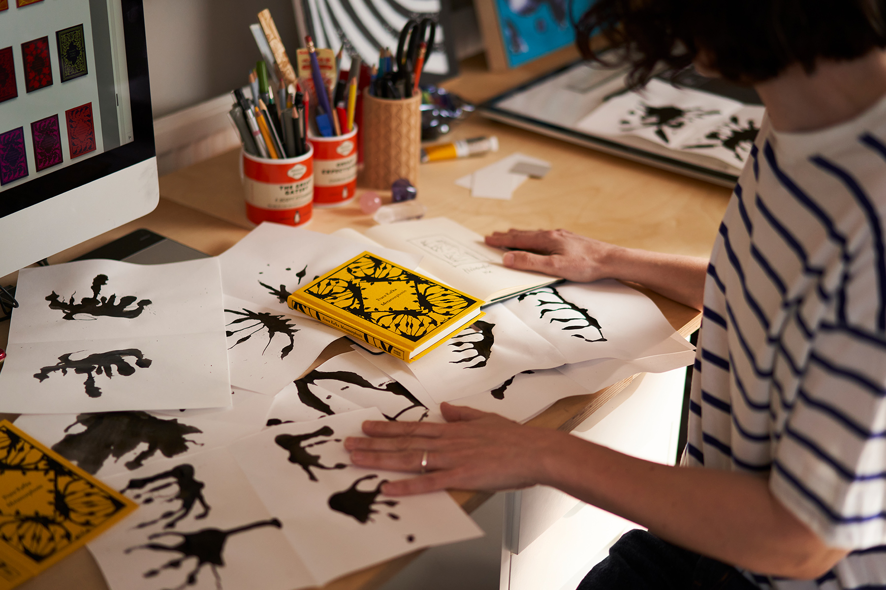
In a sun-baked attic studio in South London, Coralie Bickford-Smith is leafing through pieces of A4 paper, splattered with black. They’re folded in the middle, making spidery splodges in a funhouse mirror. “That was a stick, with a little bit of string on it, dipped in ink,” Bickford-Smith, small and a little shy beneath glasses and dark curls, explains. “I just sort of made a mess; I like it when I can have fun and I can get away from the computer.”
It is here, across this neat desk, that the most sought-after hardbacks in modern publishing come to life.
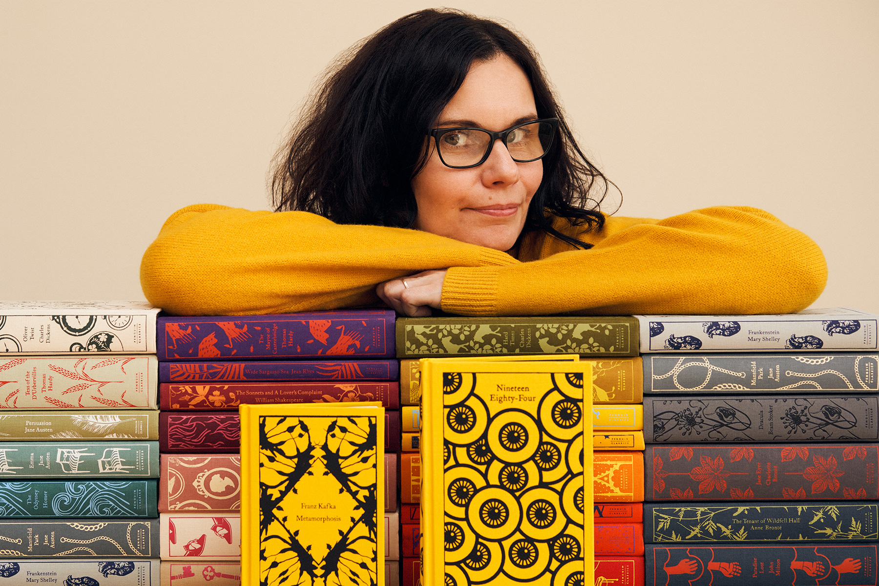
Bickford-Smith is a senior designer at Penguin Press and author of a number of illustrated books including The Fox and the Star. For nearly 15 years, she has conjured up the distinctive concept and covers of the company’s Clothbound Classics. The books have become a phenomenon few in publishing could have imagined. The now-iconic series has sold 6 million copies globally, in 110 different countries, gracing everywhere from the personal desk of Kate, the Duchess of Cambridge, to the coveted flatlays of Instagram and TikTok. And now, something new is on the way: Little Clothbound Classics.
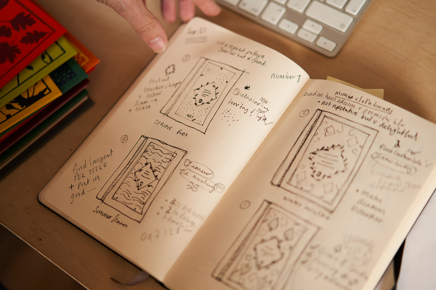
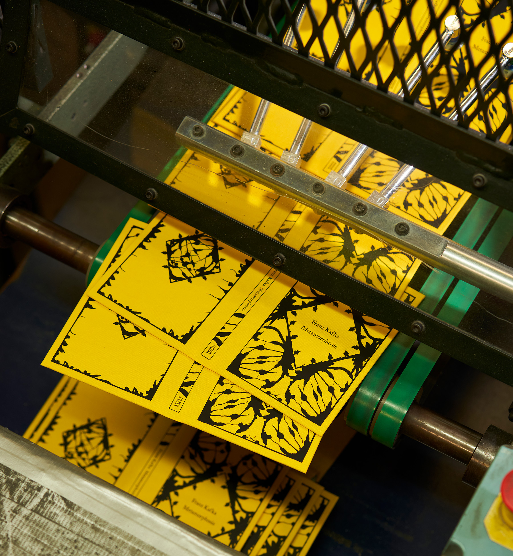
For some readers, it’s been a long time coming. Back in 2014, a Goodreads user named Nora expressed longing for a Clothbound edition of Franz Kafka’s Metamorphosis to be created. Now, in Bickford-Smith's studio, we’re looking at the Rorschach test-inspired initial works that would become the book’s cover. She went with this angle, she tells me, because for her Metamorphosis is “about his perception, and he sees everything differently as he changes. It’s also like some sort of butterfly or moth. That insect has been done so many times, and I wanted to do it in a slightly different way. I think it really gets across the energy in the book without it being, ‘Oh, here’s another beetle’.” The chosen inkblot was scanned and uploaded into her computer. In a Moleskine notebook, there’s an early pencil sketch of the strange wings occupying the corners of a cover. Beneath, Bickford-Smith has scrawled “Metamorphosis ink”. She envisaged it to be in black, on an egg yolk-yellow cover, she says: “It just felt right. It just felt really stark.”
•
Interest for beautiful, hardback books hasn't always felt like a given. In late 2007, when Jeffrey Bezos (yet to be publicly dubbed Jeff) unveiled his new creation – an Amazon book reader called the Kindle – their future looked very uncertain.
Kindles wouldn’t be available in the UK until 2009, but that didn’t abate the frenzy for them. The first version sold out in five-and-a-half hours. The publishing world seemed divided into those desperate for the digital revolution, and those in fear of it. Fahrenheit 451 author Ray Bradbury was fittingly prescient when he immediately dismissed Amazon’s creation, saying, “Ebooks smell like burned fuel”.
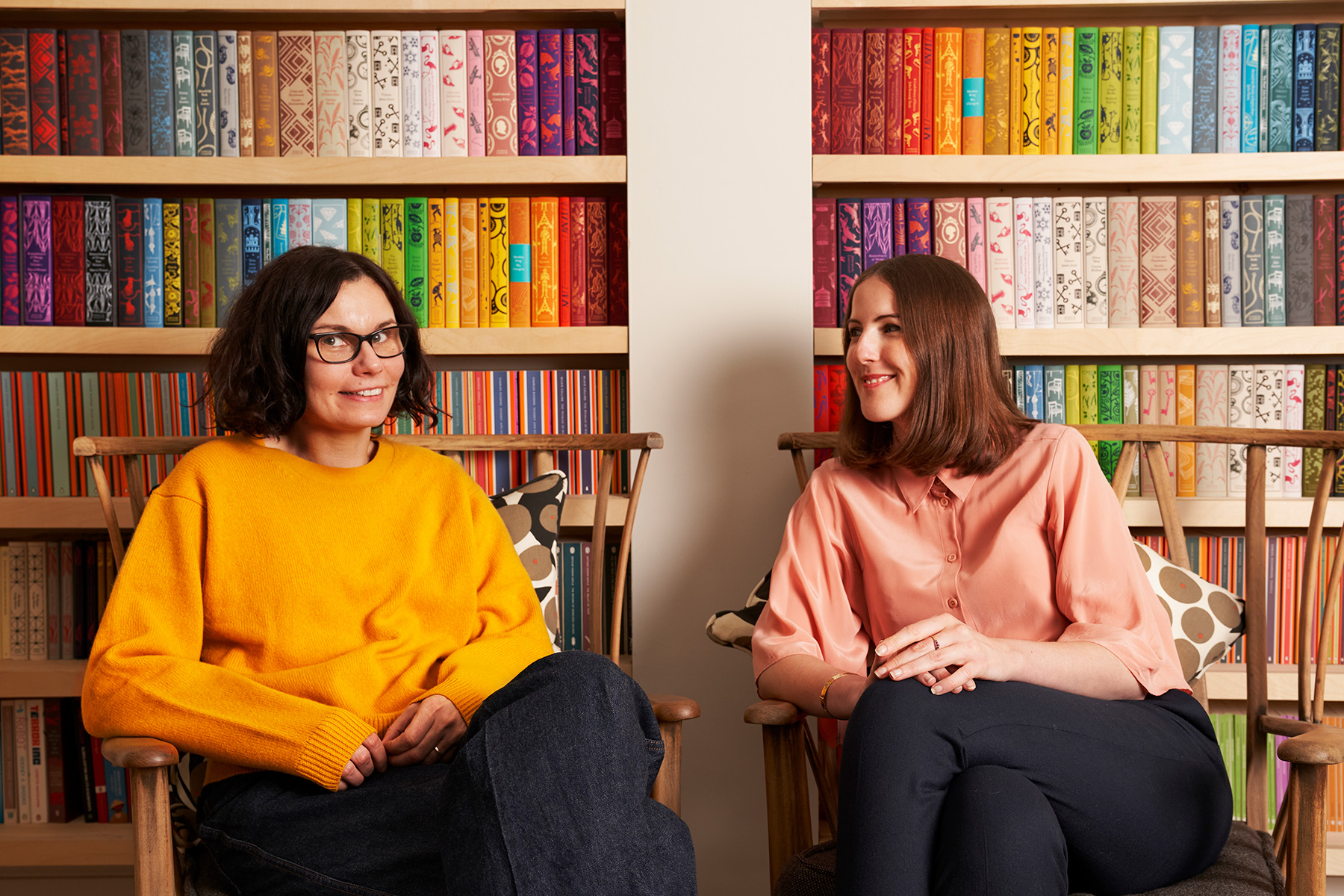
“I remember when I joined the company, everyone was so worried about digital,” Jessica Harrison, Publishing Director of Penguin Classics, explains from a deep armchair in Bickford-Smith’s studio. “There was a lot of anxiety about ebooks.”
“It was really scary at the time,” Bickford-Smith remembers. “It was like, are we going to get to do this forever, or is it all just gonna go into ebooks?” It was also a pivotal moment in the designer’s career: she had just landed a cover design job at Penguin. Until then, she says, “my career wasn’t going very well at all; I didn’t have any work at one point. It was a long road, but I got there in the end. I was very lucky.”
Bickford-Smith has been a lifelong bookworm. As a child, she was fascinated by printing marks – the coloured squares and dashes around a block of text that show where the edges of a book’s pages lie. “It didn’t make any sense,” she admits, “but I was really tuned into book design”. At five, she had amassed a collection of books that were all printed differently. “It’s only later in life that I thought, ‘Oh, there’s a job for that.'”
By early 2008, Bickford-Smith had been at Penguin for a few years, and had created what she calls “the precursor to the Clothbounds”, a book called Poems for Life, in 2007. The origins of the Clothbound designs can be traced here: the two-colour palette – of a pale, spearmint-y green laid atop a deep emerald; of the intricate linework – and the intricacy of an early 20th-century-style depiction of a tree surrounded by vines. They’re reflected in another Bickford-Smith-designed book, Hans Christian Andersen’s Fairy Tales, which was released in 2005 – again featuring the two-colour palette (neon pink and deep maroon) and the whispers of the border that would come to frame the Little Clothbounds more than a decade later.
The edition was created partly in collaboration with Waterstones, and it whet an appetite. When the bookseller showed an interest in “pursuing a broader series that was similarly collectible at a slightly better price point,” explains Richard Clesham, who manages the Waterstones fiction account for Penguin Press, it helped to spark the Clothbounds into being.
“I’d gone through the swatch books,” Bickford-Smith explains, referring to the collected samples of book-binding fabric, “and said, “‘There’s this cloth, I want to use this cloth, I want to get rid of the wraparound paper jacket, and I really want to go back to these Victorian bindings.’” She gets up and walks a couple of paces to her bookshelves tucked into an alcove, and pulls out a copy of Victorian Publishers’ Book-Bindings in Cloth & Leather by Ruari McLean. Inside lurks treasure; Bickford-Smith flicks through gilt and filigree, golden ships and embossed spines.
“This was my starting point, really. All these incredible books, all intricately designed and foiled . I wanted to know how I could recreate it using a modern day printing press, for a mainstream publisher. I didn’t want to make books that have a hardback only to go straight to paperback, I wanted to make a hardback that was really loved. It all began with this idea of a book being loved and cherished.”
No dustjacket, no paperback; instead, a look back to centuries-old techniques, and at a moment when the publishing industry was veering towards a modernity that threatened the physical book entirely. “It was not some kind of evil plan,” Bickford-Smith says, laughing, “it just happened.” Just as the book industry wondered if books as they knew them would even survive, Bickford-Smith looked to the past and radically changed their future.
•
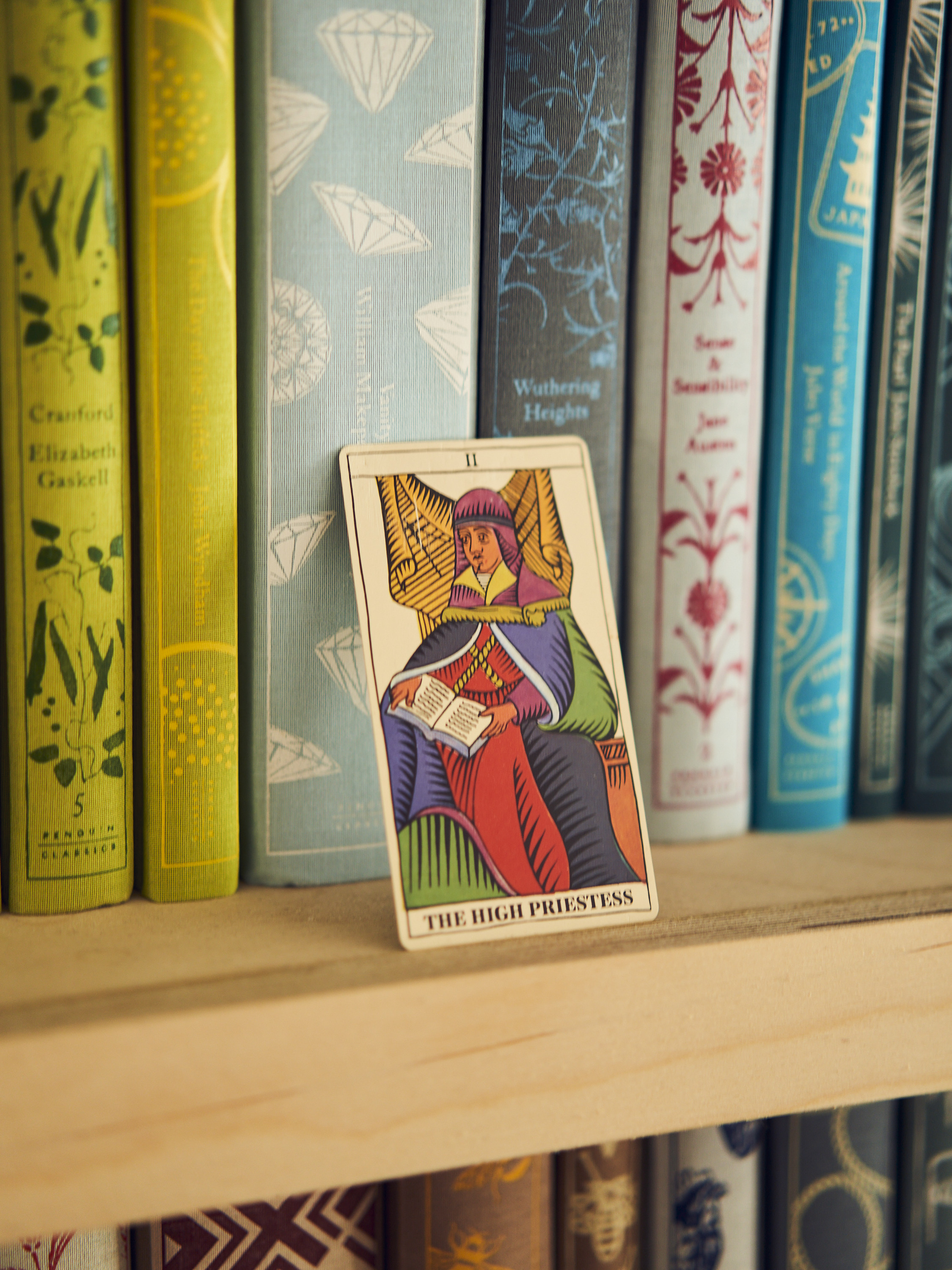
Downstairs, in Bickford-Smith's living room, the wall is lined with Clothbound Classics neatly lined up in colour order. Between the shelves is a “stuff shelf”, home to ornamental creatures, little, glinting boxes, and a Christmas tree decoration in the shape of a rainbow, shouldered by two anthropomorphic clouds. Beneath this is the first ever Clothbound Classic, Jane Austen’s Sense and Sensibility: pale blue, with deep pink flowers, growing up the cover like wallpaper. Readers would be dissatisfied – there are no words inside; this is a dummy.
Bickford-Smith went to watch these – the first ones – being printed. She can still remember how it felt in her hand. “The fact that it’s such a simple win for the cover designer, that on the back it was all pattern – no blurb. I just felt that we’d made a really beautiful object,” she explains. As a designer, she explains, it’s rare to physically grasp what you have envisaged in your head: “What you’re doing is being translated by production controllers with a printer”. But this wasn’t like that. “It was just, wow. I’d actually achieved what was in my brain.”
Getting the Clothbounds from the pages of Bickford-Smith’s notebook, or sketches on her drawing desk, and into the hands of readers was – and remains – a practical challenge. There were messy experiments with foil (the name given to the colour that adheres to the cloth to make the design’s patterns) and cloth; back then, Bickford-Smith worked in the Penguin offices, so creative experiments were undertaken there. Initially, she just wanted to understand how foil even adhered to the cloth: “There was so much foil that we couldn’t get even coverage; that’s where the idea of playing with negative space came from,” Bickford-Smith explains.
The printers were used to printing foil into cloth on the spines of hardback books, but not on the covers. “There were no books like that,” explains Harrison. “It presented the printer with challenges not faced until this point.” At first, Bickford-Smith thought that doing away with a dust jacket would save production costs. She was wrong. “Yeah,” she laughs drily, “false economy, there.”
The clothbound edition of Sense and Sensibility was released on November 6, 2008. In the 14 years since, Penguin Classics have published 85 Clothbound Classics, ranging from Les Misérables (columns of songbirds on branches, in red against black cloth, 2012) to The Lonely Londoners (the arched rafters of a train station ceiling, black on orange, 2021); originally released in “drops”, or small series, the Clothbounds have now been folded into Penguin Classics’ publishing schedule: “When we feel a book fits the series, we just publish it,” says Ania Gordon, marketing executive at Penguin Press. “What started as a sort of an initial series has just grown and grown,” says account manager Clesham.
For Bickford-Smith, the design process for each book has largely remained unchanged. She starts with the story; every symbol or “icon” that builds into the pattern on each clothbound has been lifted from the text in some way. “It all begins by reading the book, thinking about the author, thinking about the period of the book and when it was written,” Bickford-Smith says, adding that she also tends to research older covers for that title, too: “Obviously I'm working on books that have been covered hundreds of times already.”
Those ideas are sketched and scribbled, sometimes potato-printed or summoned with inky string, and then scanned, uploaded and finessed digitally. Bickford-Smith is still amazed that the same grid – or template – she devised for the first Clothbounds remains in use. She’s broken it just once: for The Monkey King by Wu Cheng’en. “It has a tiny monkey on the back,” she laughs, “which is really frivolous. But I love that book so much from my childhood. I went a bit power mad and broke my own rules.”
Bickford-Smith no longer has the drafts of her workings; designs for 85 books pose something of a storage problem. She says that often she works on the covers in such a frenzy that it can be difficult to remember where they all came from.
Some, though, stand out. Robinson Crusoe was a challenge and a favourite: she conjured up moons to show the passing of time cast away, having studied the book for her dissertation and “seen every book cover, pretty much”. The Arabesque arches that cover Tales from 1,001 Nights were inspired not only by Middle Eastern architecture but also by the theatrical set seen in the opening credits of The Muppet Show. It was only later that Bickford-Smith realised the cartoonish eyeball that covers Nineteen Eighty-Four resembled Skipper the Eye Child from British TV horror series Garth Marenghi’s Darkplace.
For Clothbounds, there are no cover meetings, where cover designs are briefed, examined and critiqued – an anomaly in the world of publishing. Bickford-Smith designs, and Classics accepts. “We don’t do them,” explains Sam Voulters, Brand Director at Penguin Classics. “Coralie is entirely trusted just to go off and find what's spoken to her in the text of the book and come back with a design. It will be shown, but it won't be discussed.”
•
It was in the raw, first days after the second lockdown, in early 2021, that a new series of Clothbounds was discussed – one that reflected the seasons, and were smaller, like the Little Black Classics that were launched in 2015. A year later, and the team behind the Clothbounds were seeing the covers for the first time in a meeting room in the publisher’s offices. Brightly coloured specimen cases – the name given to a hardback cover without any pages inside – were passed around.
“They’re just going to look so irresistible,” Harrison says at the time; “Imagine a table of them, jewels that you’re going to want to pick up.” There are discussions about size, about how nice the books will feel in the hand. Bickford-Smith’s designs, as always, are the starting point. It will take weeks for the team to even name these small books: not ‘Mini-Clothbounds’, but ‘Little Clothbound Classics’ – “like,” Voulters will later clarify, “Little Waitrose”.
•

It's a warm, early summer day in 2022 and I’m standing in a labyrinth of warehouses and redbrick buildings in Bungay, a pretty village in North Suffolk. This is Clays, where books have been printed for more than 200 years. From this complex system of processes and rooms, 160 million books are published every year; among them, the Clothbound Classics.
I’m shown around by Alfie Boggis, a bindery manager who has worked his way up at the printers after starting on “the shop floor” – what the staff here call the factory. Boggis is tall, well over six feet, beneath a hi-vis and cropped blonde hair. Over the course of 90 minutes or so, he patiently explains the intricacies of printing books that take inspiration from Victorian binding traditions, pointing out the different machines: the ones that stamp the coloured foil into the Brillianta cloth that wraps around cardboard cases, or covers; the ones that print 23,000 books an hour onto paper, which is divvied up into bundles of pages; those that that round the spine of a cover and give it two neat dimples on either side; that put a ribbon in place, or a fabric binding at the spine, that lay down the right amount of glue; and the vat where the glue pellets are melted down. There is a small motorway for forklift trucks here; there is a whole corner where a man sprays the edges of stacks of books blue, by hand, with a nozzle on the end of a hose. Every now and then, you’ll see an employee subscribing to the “10 book rule”: for every 10 books printed, one must be checked. They paw through the pages and flip over the cover, before putting it back on the pile, satisfied.
Boggis’s explanations are translated through foam earplugs, worn for protection against the constant repetitive purrs and squeaks of the machines. Above it all music plays: Nickelback, and then Abba – the employees take turns to choose what they put on.

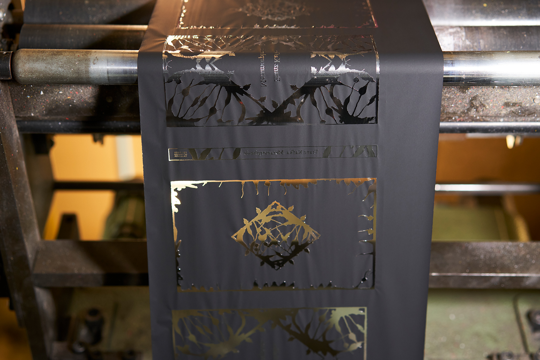
When the Clothbounds challenge was first put to Clays, back in 2008, it ushered in a new way of doing things: foil designs hadn’t been stamped onto fabric covers before, only the spines. Since then, the teams in the printers and those looking after production back in London have navigated all manner of small dramas. Paper “belly” bands are now wrapped around the Clothbounds, introduced after the adhesive on price stickers caused the foil underneath to come off.
This was too labour-intensive for the Little Clothbounds, which are published 12 at a time. So Bickford-Smith’s design has built in a gap, where the stickers can land without any foil peeling off. Over the years, certain colour combinations of Clothbounds have become akin to endangered dinosaurs. “We have real issues like obtaining colours that Coralie wants,” explains Taryn Jones, a senior producer at Penguin Press. “Some colours will get discontinued. We have to say, ‘Right, Coralie, can we slightly change this?’ Some of the designs started out differently to how they’re being printed now.”
The rise of the Clothbounds – of the colours, of the series, of the sheer quantity being printed – has changed things at Clays, too. “In the six years I’ve been doing this job I’ve never known anything like it,” Boggis explains. “We used to have an area where we’d store the rolls of fabric. Now we’re at a point where we’re trying to source a new place to keep them. It’s like Carpet World down there.”
Boggis takes me to Carpet World, Bungay Branch. It’s a kind of Clothbound-specific haberdashery: there are rolls of the ribbon – used as bookmarks - with the words “Hard times” neatly written on labels, piled up with pre-cut olive green fabric, ready to be foiled and wrapped; I spot “Pride and Prejudice” (a golden yellow) and “Wuthering Heights” (royal blue). “We’ve had such an increase in ribbons that we’ve had to store them on racks, now,” he explains.
In another corner of the factory, the first copies of Ryūnosuke Akutagawa’s Hell Screen are being pressed and bound. The pages come down a conveyor belt, encased in navy endpapers. A machine picks them up and unites them with the lime green clothbound covers that have been pre-stamped with Bickford-Smith’s swirling, abstract faces. The two parts are clamped together and popped out onto another belt. Boggis picks one up, passes it to me: “Hot off the press,” he says, with a flourish. It is: I feel the warmth sink into my palms, just as Bickford-Smith had with Sense and Sensibility 14 years earlier.
•
Although the Clothbounds were established before 2020, three things collided that year to dramatically heighten their presence in the books market: the pandemic, which saw physical book sales skyrocket; Barnes & Noble stocked the books in their 600 stores across America, taking the Clothbounds stateside in a meaningful way (Tom Ward, Global Sales Manager for Penguin Press, noticed Bickford-Smith’s covers appearing in Barnes & Noble’s window displays and remembers it as “a massive deal”); and Gen Z readers began giving Clothbounds a whole new life online, through social media.
A corner of Instagram had long been a home for the intricate designs and unabashed enjoyment of books epitomised by a Clothbound Classic: there are 13,700 posts that deploy the #clothboundclassic hashtag, many of them “flatlays” – photographs taken from above of a well-curated still life, such as alongside a scented candle or cut flowers – and “shelfies” – beautifully arranged bookshelves. Certain users have dedicated entire accounts to their Clothbounds: Leah Sowards, a 27-year-old nurse from Ohio, launched her book-based Instagram account, @coffeesoakedpages, within a week of picking up her first Clothbound Classic in December 2019. She posts wistful, sepia-toned images of books resting on crisp bedlinen and shouldering cups of black coffee; the pink-and-red abstract cover of the clothbound edition of Albert Camus’ The Outsider is a rare bolt of colour on her grid. @coffeesoakededges now has more than 21,000 followers. “No-one in my immediate family is keen on reading, so it is a delight to share and connect with others across the globe that love reading as much as I do,” Sowards tells me over email. “Sharing my clothbound collection on Instagram has enabled me to form meaningful connections with others that share my interests.”
But while Clothbounds have been appearing on Instagram since at least 2015, the rise of celebrating books on TikTok – a platform that originally exploded because of its user-generated dance routine videos in the late 2010s – offered them a whole new arena: at the time of writing, videos using the #clothboundclassics tag on TikTok have been viewed 5.5 billion times.
For Gen Z, the arrival of Clothbounds in the late 2000s collided with a pre-adolescent awareness of independent reading and books more broadly, explains Fiona Cameron, assistant AV producer at Penguin and avid TikTok user. “I remember being about 12 and going to the shopping centre with my friends. I’d only seen a couple [of Clothbounds] at that point, but they really stood out to me,” she says. “It was just so different, in terms of the colour and the pattern. There wasn’t really a logo. It was just like, ‘Oh, who is this from?’ It was this mystery that just sort of turned up one day.”

That mystique, Cameron says, still fuels a lot of TikTok's fascination with the Clothbounds: “Coralie is a bit of a mystery to people. I didn’t really know what she looked like, I’d only seen one picture of her which is quite old now,” Cameron explains. “It’s so interesting to have these books where you know who the authors are, but you don’t know who designed the series – and not knowing something makes it even more interesting.”
While Bickford-Smith is on Instagram, where she maintains a lively community with her followers (“I just really enjoy their friendship, and I enjoy chatting about books,” she says. “That's how I engage with them”), she isn’t on TikTok, and Cameron says the two audiences haven’t crossed over much. But in her absence the built-in riddles of her designs – the planes that span Mrs Dalloway or the scissors across the cover of Little Women – have become catnip to an audience raised on unravelling pop culture mysteries online.
“It's a huge part of why I love them so much,” says Stacey Yu, who is 24 and, alongside her day job in brand consulting, runs BookTok account @literaryfling. In February, Yu uploaded a 70-second video that explained the meaning behind several of the Clothbound’s covers. It has since been viewed 288,000 times. “And I also love that people can see [the covers] very differently. For example, with War and Peace, my boyfriend said the comet is what characters see last when they look to the heavens and find contentment, but then I had a comment saying, ‘Well, it's actually The Great Comet of 1812.’ So I don't know what it actually is, but it's nice to see that people can interpret it in different ways.”
News of the Little Clothbound Classics broke in April 2022, four months before the series would hit the shelves; two months before that copy of Hell Screen landed in my hands, and it broke on Instagram and TikTok. “RIP my bank account,” one follower commented beneath the post on Bickford-Smith’s profile; “Am I correct to infer that we might be getting 48 books in a YEAR?! Color me astonished! [sic]” wrote another.
“I think it’s always exciting to see new work from artists that you like, it’s like waiting for a new album from your favourite singer or something,” Yu explains. “When I first heard about the project, I was just so excited to get all the covers that would come, because it’s not just one book, it’s a whole collection of books. Little Clothbounds? The fact they’re small makes them even more collectable.” Yu received a bundle a few weeks later: early copies, along with a signed note from Bickford-Smith. Hype and jealousy poured into the comments box beneath the video she posted to TikTok, captioned: “the only thing i like more than beautiful books is little versions of beautiful books”.
•
The Clothbounds began with Bickford-Smith’s idea “of a book being loved and cherished” at a moment when physical books were threatened by the rise of online content. Cautious estimates may have imagined the Clothbounds’ allure, but nobody could have envisaged that their most fervent audience would have lived online, in all the shelfies and the videos, in the memes and the flatlays; that the internet would become the place where physical books, centuries-old titles printed in ways inspired by Victorian bookbinding, could find new meaning.
“They’re the proof that our industry is alive and well and stood the test of time,” says Harrison. “They came out in this moment where it felt like physical books might be in real danger. It’s a celebration not only of the literature, but the actual book itself. There are so many ways of reading and listening now, and yet: people still do care about books.”